
The final assignment for Drawing 1 is with my tutor, feedback is in a week or so, and all (all?!) that’s left is to prep for formal assessment in July. So I’ve been exercising my painting muscles and starting with a copy. I’ve done quite a bit of copying for drawing and found legitimacy for this in various parts of Will Gompertz’s book, ‘Think like an artist’ (2015) where the notion that ‘artists steal’, imitation is the basis of emulation which goes on to become integration (of the many styles) and finally innovation, and pinching an idea is ok if you then take it somewhere different. I’m not sure that would work for cars but for now, this will do.
My drawing has improved, I’ve learned that repetition leads to fluidity, and I can see how Picasso’s 1945 Bull came about. I’ve also discovered that I like large.
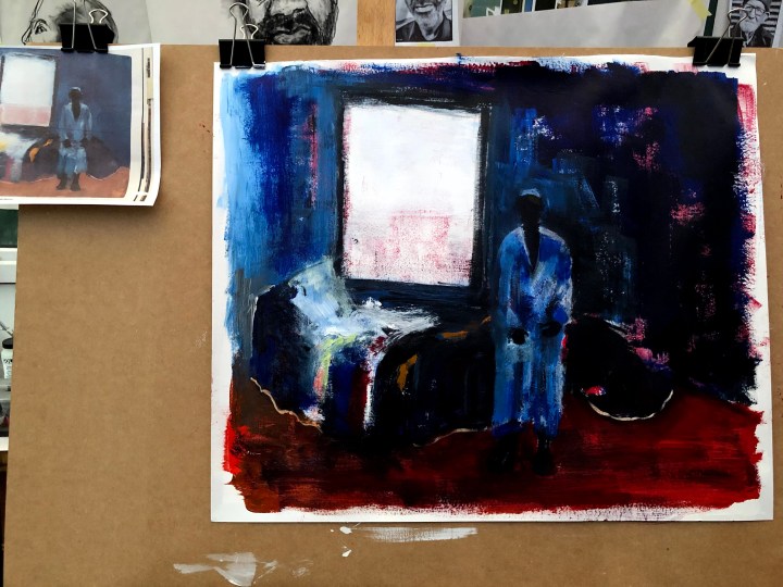
I found a book and bought a book. The second is about colour (Hornung, 2019) and I have only flicked through it as yet, and the first is the Collins Artist’s Manual (1995) which I got from a friend who was having a clear out. Why this one was up for rehoming is a puzzle as it’s a beautiful book full of tips and illustrations and with every page in brilliant colour. I took my first image for copying from this although when I came back to the original when I’d finished, I could see that the picture was much lighter than my printed copy and that detail I was unable to make out was much clearer. Do I return to it or leave it as is? I have definitely changed it by using a different style (more mine than artist Anthony Fry’s) so perhaps it should stay.
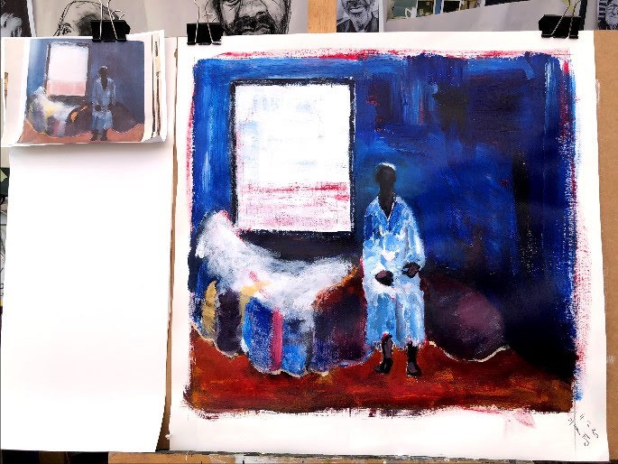
Oddly, the print looks lighter on screen than in actuality but here’s a digital rendering for comparison:
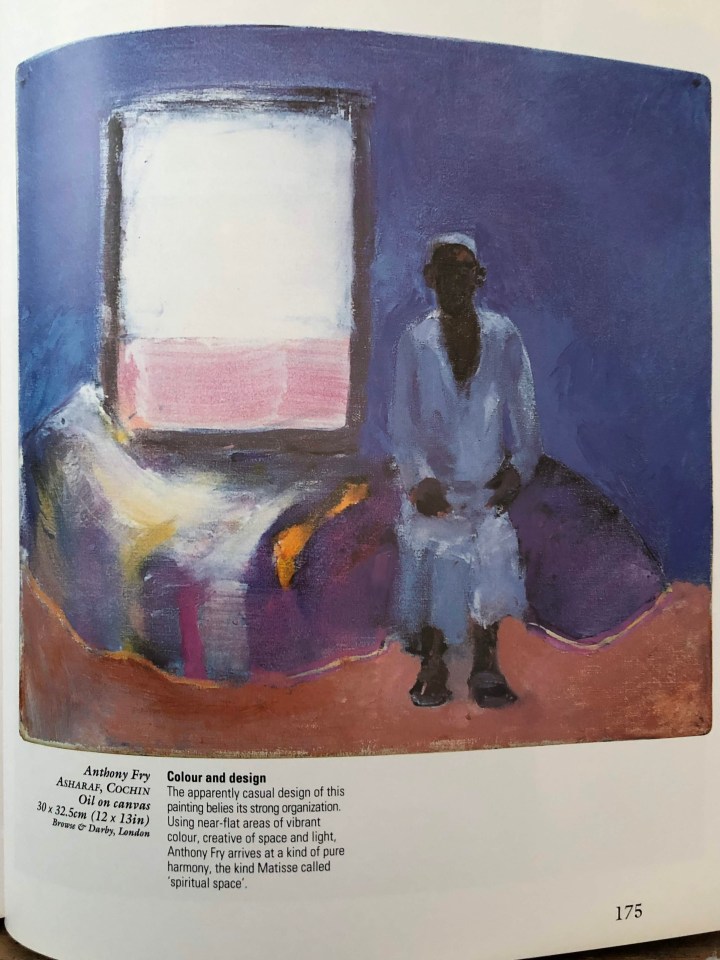
Actually, what I can see now is that the man is sitting on the bed which, although a slightly odd shape, is lengthways under a window; he’s not standing in front of it at all! I may revisit this and use my monitor for reference because the detail is far more apparent and I’d really like to get to grips with that.
4th Feb, revision. I still don’t get the shape or perspective or lie of that bed, but I think the execution is better – more dry brush and more me than Fry in terms of the how of it. My man seems now to be sitting and that’s an improvement.
Gompertz, W., (2015). Think Like an Artist. Penguin. Kindle edition.
Hornung, D. (2019). Colour, a workshop for artists and designers. Laurence King Publishing Ltd. Second Edition.
Artist’s Manual. Collins 1995. P175.
