
Where can you see Banksy, Damien Hurst, Grayson Perry, Sir Peter Blake, Bob Dylan, Ronnie Wood, and Billy Connolly originals within a few yards of each other in right-on-the-street galleries? Yesterday*, a friend and I went to Brighton.
*Yesterday is now several weeks ago, life having got between me and this write-up.
Castle Fine Art Gallery

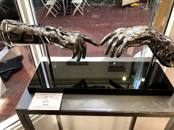
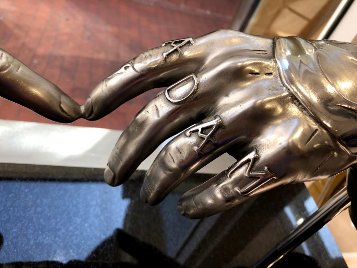
Castle Fine Art is right slap bang in the middle of Brighton near The Lanes, and my goodness I had not expected to see so many originals by ‘names’ from both art and show business. First though were these metal sculptures, each of them different and but one based on the Michelangelo painting ‘Creation of Adam’ c. 1511. By Dan Lane, this one – Modern Relic Arms | Creation of Man – is intricately embellished and looks like the metal or burnished leather of protective armoury. They seem almost wearable.

I found these less attractive, rather saccharine in fact.

I am not really a fan of celebrity-based art, so much of it seems essentially derivative and harking back to those Marilyn Monroe prints by Andy Warhol. Those were nearly sixty years ago, these feel like 21st century children dressed in the same clothes as their great grandparents. There were plenty of them so presumably they sell.
I have no idea what this represents – the ascent of man atop a corkscrew? The title is Devolution and so I am assuming a reference to the impact of alcohol. Perhaps the final figure, swigging from the bottle, is about to fall off the edge.


These are also by Nic Joly who seems to be a statements man. I was interested at first in the ‘shop window’ presentation – the piece of art sitting on a platform behind glass as though it would be taken out and wrapped separately for sale. It’s usually the little item in the window you buy, not the shop or its window.

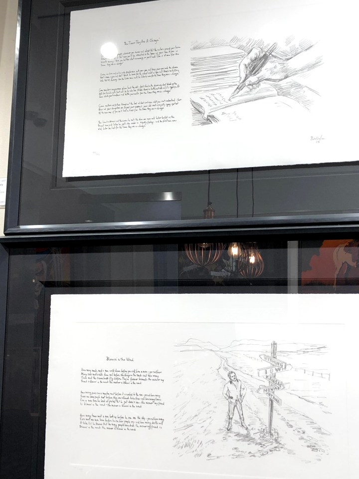
Astonishingly, these are by Bob Dylan who took to illustrating his own songs. Seeing these first, I rather wished he hadn’t. The paintings, on an adjacent wall, I thought were redemptive.

I am a sucker for some drama in colour, and I’m coming to realise that I also favour broad horizons and associated horizontals in landscapes. I believe this comes from watching The Bridge where the production values ran to extraordinarily cinematographic visuals.
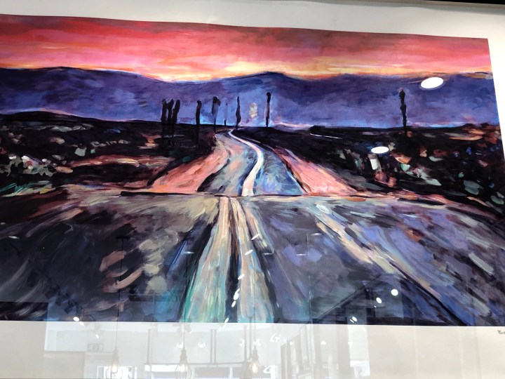
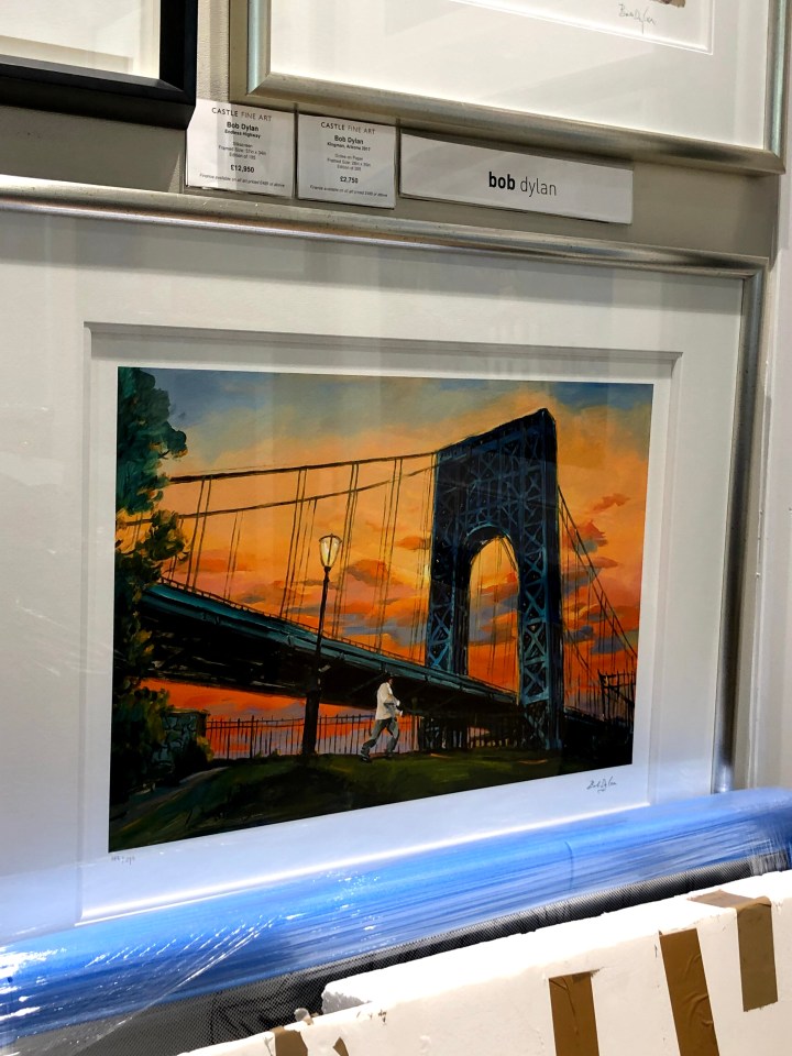
This painting is full of difficult perspectives and planes – the foreground is more or less straight on, the bridge runs from a high close left to a low distant right, and the clouds head very slightly along the other diagonal. So much trouble to get into, making those convincing.
And here’s another with all kinds of tilts and diagonals, all of them ending in a focal point behind the white building which is the only element (almost) straight on vertical and horizontal.
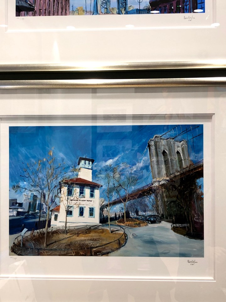
I hadn’t noticed at the time but Dylan must really have a thing about bridges. This one links two tall and intimidating buildings made less so by being quite jauntily coloured.


Sometimes when I look at something, my first thought is that it’s a cheap shot – fur coat and no knickers, as the phrase went in my northern upbringing. It meant all show with nothing substantial underneath although it sometimes seemed to have a more literal application. This is one of those; an original-ish idea with an original-ish execution, and a wholly unoriginal message. Even the artist’s name is a cover – Alex Echo? Really?

These, on the left, are by Paul Kenton who uses an aluminium base for his work – something that was a bit of a theme in a number of other galleries. Aluminium is this season’s go-to support which suggests that using it next year may not be a good move. As for these, again the magpie in me was attracted to the colours while my inner beginner artist fretted over the perspectives I struggle with.

The gallery was very accomodating with regard to photographing their exhibition. The only exclusion was Ronnie Wood’s work, Wood having placed that constraint in the contract. When I asked out of curiosity why that was, the reason seemed to be related to the layers in the works that would not photograph well by visitors, especially through glass, and looking carefully at these elements, I could see his point. There are patches and squares in the mix, textures and scrubbings of colour that would not resolve easily under the casual lens. I don’t know how he made the images and neither did the person I asked. I also don’t know how to judge them. I liked them but are they ‘good’? And by what standard? Would they have achieved prominence if Ronnie Wood had never been a Rolling Stone? Big questions.

Kellie Miller Gallery
No photography was allowed in this gallery, other than of the 3D (ceramic) pieces which I didn’t find very interesting.
There were some intriguing pieces which appeared to be digital/photographic although the artist had said they were neither. There were no clues as to what the artist’s method might be but if I were to set an anchor point, it would be the colours, size, and orientation of the Kenton pieces above. These are far less direct though; with elements emerging from shadows and shapes resolving only on close inspection. There is a hint of collage but no real indication of that additional slight depth or texture. Perhaps he made these items physically and then printed them so that all the tiny bumps were ironed out. I realise now, too late, that being unable to take a photo means I should take a note, at least of the artist’s name, and I didn’t. When I go back to a new exhibition, I will remind myself that notes were what we made before we made Facebook posts.
The exhibits in a nearby gallery were very varied with some, I thought, verging on the amateur. I’m aware of taking a judgmental stance here that has an unedifying strand of superior attitude beneath it. It requires some thought to recognise that, like fiction, it’s possible to recognise something of quality (although how I judge that is a mystery to me) that I may not like, and to like something that I regard as being targeted at ‘the popular market’. Snobbery? Maybe, but creative products are all judged and the measures we use differ according to our understanding, experience, and motivations. As with Ronnie Wood’s work, I wonder if some accrue value because they have a name while other – better? – works are passed over due to their lack of profile.
These pieces seemed to me to be appealing to a less savvy – some might argue, a less easily fooled – audience. Wall pictures in nice colours that could seem sophisticated. That said, I would be delighted to have something hanging in there because I can be as hypocritical as anyone else with a product to shift.


Art Republic

Art Republic is a different matter altogether and without knowing whose work was on show, I immediately felt that here, quality took precedence. The Brighton branch is in Bond Street which is again in the Lanes, and just inside the doors were original pieces by Banksy, Peter Blake, Damien Hirst, and Grayson Perry. This is a street. In a town centre. You just walk in. To say I was taken aback is putting it mildly.
Peter Blake, I think, and while it’s easy to dismiss as ‘just’ alphabet bricks in primary colours, these are designed bricks carefully assembled and mounted in an impactful array. I gather they could be purchased separately.

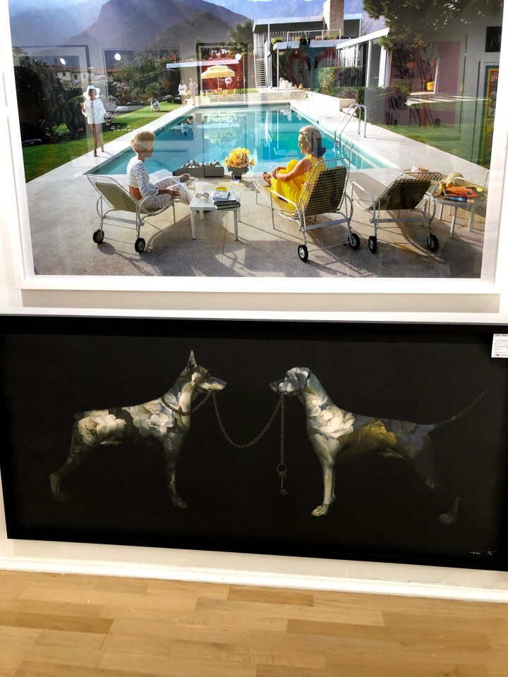
I have no idea who made these but the first struck me for its Hockney-ish colours and subject matter, it’s 1960s Hollywood gloss, and the feel it has of an advert for the aspirational lifestyle. Americans had walk-in fridges before we had fridges at all, we saw them in TV shows while we kept our milk, butter, and cheese in a larder under cloth covers. These were different worlds.
The one beneath is striking for very different reasons – the metallic appearance of the dogs, the stark singular images on the dark ground, the lead of one being held by the other. But look, the one whose lead is being held als has hold of it, and her ears are up, she looks assertive and in control. The other, still holding the far end of the lead, has her ears down and seems to be considering whether or not she has the power over the other dog that she’d imagined. But their coat patterns are flowers; are the dogs are decorative? Statement dogs left to look after each other?
These were being unwrapped when we visited and even though I was given permission to take a photograph them, I decided on an angular shot to defeat plagiarists. This artist – and here we are again, anonymous due to my note-taking deficiencies* – places modernistic features in classical style so here are people who seem to come from a film poster but with Brighton pier in the background and cherubic forms in the sky. He also adds dabs of gold colour onto the prints as a final touch. Here, it’s highlighting chips being stolen by Brighton’s ubiquitous and opinionated sea gulls.
*Saved by my friend – it’s Cosmo Sarson. Thank you Annie.

Top: Grayson Perry’s detailed, line-based, ambiguous naked figure in a domestic setting full of clutter. It’s like a cartoon; one of those where you have to find the five baskets or ten pieces of fruit. I’m not certain, but it may have become one of the tapestries he produced for a TV documentary a while ago.

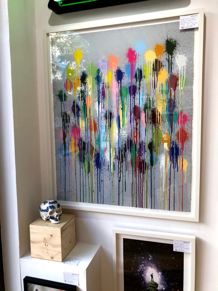
By Ian Davenport, this attracted me because it seemed to be taking the mick out of Hirst spots. I have no idea if that’s true, but I like to think there was a subversive plot afoot here. I also like the randomness of the drips and dribbles, to me far preferable to Hirst’s dotted regularity.
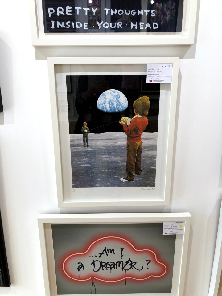
Joe Webb’s Transmission shows two lads, looking like young Bowies, using the tin-can-and-string method of communication so many of us thought we’d invented as 1950s kids. Who knew that within our lifetimes we would be watching men walk on the moon and, right now, the Mars 2020 rover being built and live-streamed from NASA’s clean room. This image makes that point, I think.
I asked the gallery staff about this and the use by the artist of Banksy’s images in this piece which is actually an expanded folding card. It seems he, Patrick Hughes, knew or worked with a mentor to the group known now as the Young British Artists (YBAs) at Goldsmiths college, who then approached Banksy for permission. I should have asked then if anyone could confirm Banksy is male. There can be no better disguise than everyday sexism – who pays any attention to a woman scoping out suitable walls to paint on?


Damien Hirst: in contrast to his spots and dots but clearly along similar lines, this depiction of drugs – pills and capsules – all in black and sitting on glass shelves as if they were shoes on display in a shop seems to point to a commodifying of illness. As a piece of imagery, I think the perspectives and tilted lines, the effect making the mirrored images more prominent lower in the picture and doubling the quantity of pills, has a dramatic effect. I was drawn to it without knowing whose it was, which tells me something about judgment and the internal wrestling that goes on for me about quality versus market price. I saw quality here before I saw market value in a name.

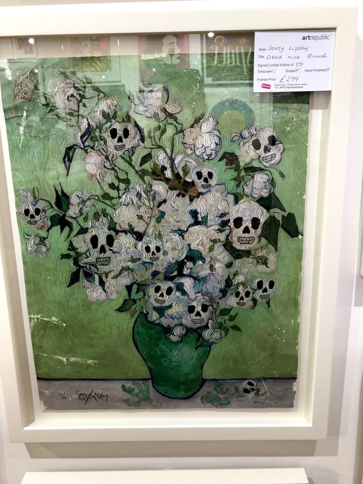
What to say about Soozy Lipsey’s Dead Mice Bunch! For me it was an antidote to some of the more saccharine floral images I had seen in galleries elsewhere, and as a bonus has a skillful combination of line, texture, and a simple limited palette. I might have been tempted to buy that.
Yep, that’s our man – or woman!
By Euan Roberts, I’m really not sure what this is about but it seems to be saying something about being simultaneously trapped and not in need of assistance – the moon waving not drowning? Who knows, but it has the clean look of a postcard you might write a cryptic message on the back of and send to a knowing friend.

Peter Blake reprising his Sgt Pepper format. At the top is BBC1, and the bottom BBC2. They look like a point in time of popular programming.

Unfortunately, even with zoom I can’t make out the name of the artist but in fact what had intrigued me was the application of colour: the scratches and runs held together by one or two precise marks that contain them. When I can’t get these colours myself, it’s helpful to know that some, like Klimt, use gold leaf.
Magnus Gjoen: The devil hath power to assume a pleasing shape. These look like a form of applique but the artist doesn’t give his technique away. There’s the Victoriana/modern warfare juxtaposition and also, as the title suggests, the knowledge we all have that big money often drives wars. If you are a maker of arms, they will please you when another power likes the look and buys them from you.


I think the card on these top pieces reads Dan Hillier. Photographic, Pythonesque, surreal, with striking diagonals of negative space. I don’t know if they’re drawn, or if they are whether they’re physical or digital but there is an intricacy of pattern and the two together make a separate composition. You would have to have both.

There were other galleries but none that offered the qualities of the ones I have described here. There are many more; Brighton has modern and traditional within walking distance of each other and interspersed with as many coffee shops and restaurants as you can manage. My plan is to visit Kellie Miller and Art Republic again soon, plus some of the ones we didn’t have time for, including the Pavilion which I last visited ‘back when god were a lad’.
Brighton of course, is a gallery in itself.


Footnote: at every gallery I asked about their photography policy before looking at any of the exhibits. Without exception, they were accommodating and clear. Only one had an exclusion and that was on the artist’s instruction.

I’m always very self conscious when thinking of going into those places… the things they sell are way out of my league! Do the shop owners mind people wandering in and looking around with no intention to buy?
LikeLike
These didn’t and gave no impression at all that they might. They all welcomed questions and some said they really enjoyed it when people showed an interest. They certainly engaged with them anyway, and I had the feeling that asking about how works were made, permissions, and the like gave them different ways of thinking about their own exhibits. Absolutely no one was sniffy, but then this is Brighton where arty is the norm, even for people who aren’t.
LikeLike
I suspect this is something for me to get over… after all a gallery is just a posh shop. I think overcoming my issue on this is just part of the education I’m getting from the OCA course. I’m going to make the effort to go have a look round when I’m next working in Glasgow. 😀
LikeLiked by 1 person
Glasgow should be pretty artisan what with Glasgow School of Art being such a high profile institution. Go in with your ‘Hello!’ face on, tell them you’re an art student, and ask if you can take photos. Then ask about what would be the best/newest/most exciting artist there to look at. Once you’ve got used to engaging, my guess is you’ll soon have questions to ask about what they know of this or that artist’s technique and to point out small areas that have grabbed your attention. I went with an artist friend so we could talk arty things with each other and then go asking questions. I have to say, I hadn’t expected to be so well-received but I think that first ‘Hi I’m an art student (even if I look a bit long in the tooth – cue laughter) what’s your photography policy because I have to keep an online blog for the course and is that really a Bob Dylan over there?!’ can open doors.
LikeLiked by 1 person
Love it! Ok you’ve persuaded me… I’ll do the google dance and find some places to go loiter… hopefully that are friendly to (mature) students. 👍 Working from home for a couple weeks more but I’ll definitely do it!
LikeLiked by 1 person
I think you’ll be surprised at how much you know, what bits and bobs of all your reading have stuck, how it’s possible to ask without implying stupidity, that open enthusiasm and interest really engages people who quite often are just standing around taking money, watching people wandering about clearly clueless but not asking, or having to put up with idiots who know a bit and try to score points over them.
LikeLike