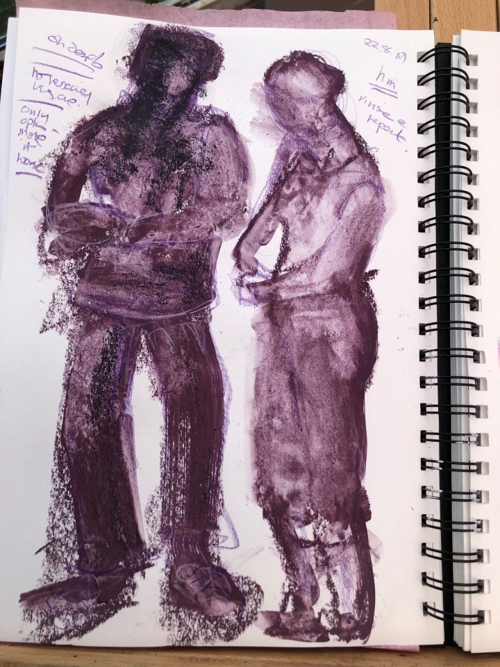
These are disasters but on the assumption my efforts will improve, I am posting them for evidence of progress. There was no rescuing the one on the left, everything made it worse. On the right there’s at least some volume and shape to be seen. Soft pastel brushed with water on A4 cartridge.
This is a figure found on the internet. The first is pencil drawn then filled out with soft pastel. I left the face unfilled to reflect the rather bleak look the man is giving the camera. The second is conte with more attention to the face (not so successfully, I think) and less to the body line. For me, the face on the left works best and the body on the right. The arms on the right are in better proportion and the hand shapes more proportionate and less dead! The eventual task requires an A2/A1 drawing taking about an hour to complete [this goes for each of the three poses] so I need to decide which of these to pursue.

Went for the grumpy man for this first attempt at A1 size. I had a sheet pre-prepped with gesso mixed with orange Ecoline ink and used a sympathetic soft pastel to draw out the shape. I’ve also used white soft pastel almost as a reductive tool to make some of the facial features. I want to look at it again after a short break; his expression looks more needy than grumpy in this version and I think it’s because his eyes emphasised too much.
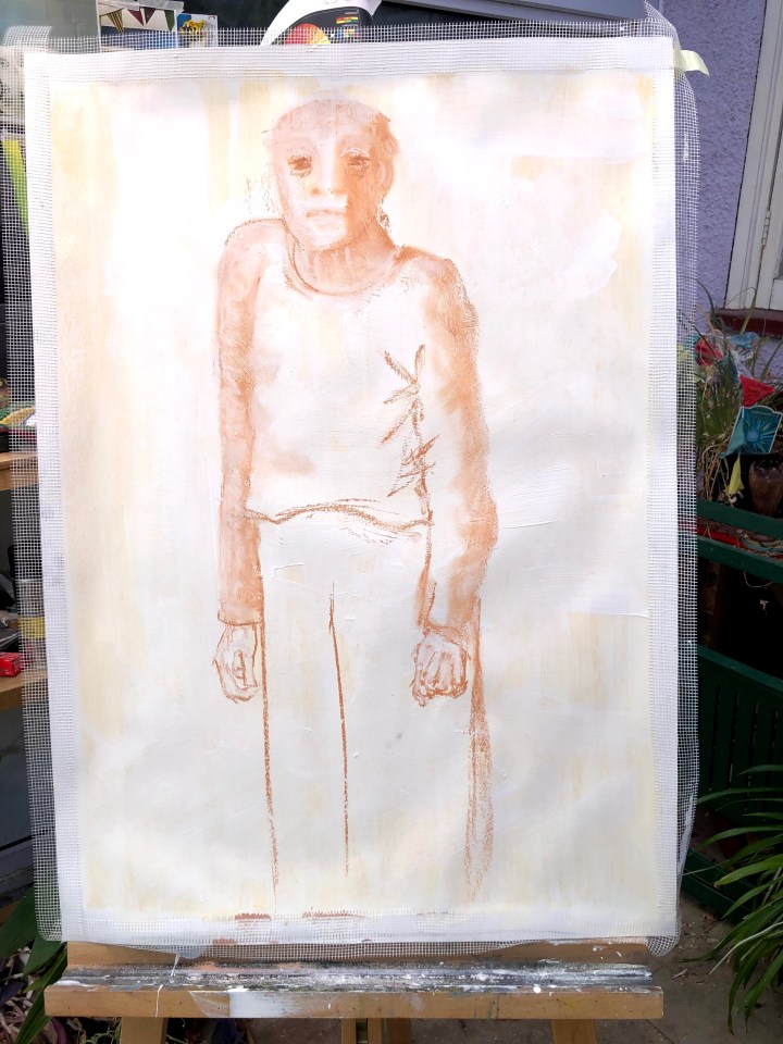
Tiny adjustment to the eyes and I think I need to leave this now. The temptation is always to fill everything in and leave no white space but it never improves anything for me. The sweatshirt does look a little like a vest due to shading up the arm and reduction on the shoulder. I may come back to that. Does it look like ‘him’? Does that matter? For me, the face in the first is closer to the photograph, and the body in the second, but the overall older person image – slightly lost, a little angry, possibly annoyed – feels more authentic than simply replicating one of many expressions a person might wear.
Oddly and unusually, I think this looks better in actuality than it does rendered digitally.

What did I learn? Again it’s about practice and rehearsal of movement, one of the reasons I chose to sketch at the scale required for the eventual task. Lines became easier and proportions more intuitive as they flowed without so much conscious control. My initial sketches are always quite tight – constipated in fact – relying on measurement rather than gesture, something I translate as moving from replication to grasping the sense of the object or person.
***
The next figure needs to be sitting and since I’m not using a live model, this will be a different person. Again using Google search, I’ve found an image of an older woman snoozing in her chair.
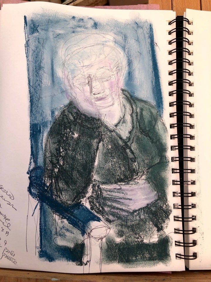
For this first sketch, I just wanted to find the shapes, particularly of the way her head rests on her hand and her arm rests on the chair arm. The way she does that is somehow light even though the weight of her head runs all the way down to her elbow. I also wanted to find some colours and maybe again leave her face pale, so I’ve used soft pastels in white, lavender, blue, and a deep green of similar tone to describe the various elements. The under drawing is biro. The photograph is not full length so the body stops just above her knees.
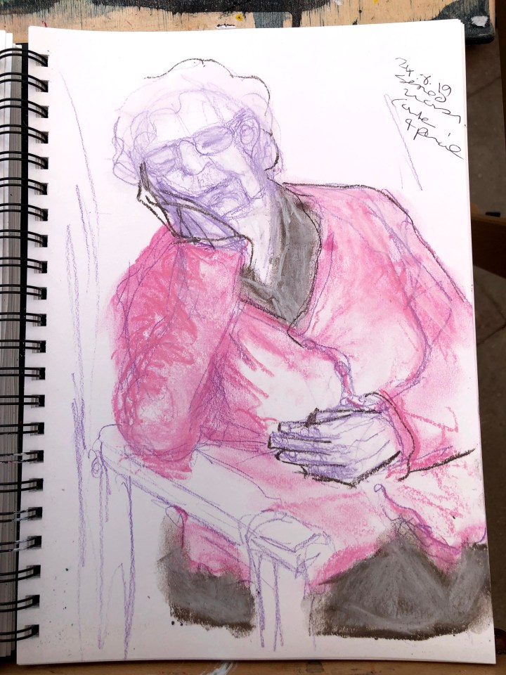
This sketch is in pencil with coloured conte and some limited outlining. The head angle looks better to me, also the lower hand and arm. The leaned-on hand is – for me anyway – a tricky shape and I used the outlining to pull out the triangles there. I’ve left much more white space to suggest rather than give undue prominence to the seat.
The task requires the use of different supports but, at this scale, I’m limited to cartridge and so, as with the standing figure, I’m using medium to change the surface. This time I’ve mixed gesso with pumice medium which is gritty and would probably shred soft pastel so I’ll be forced into using something else. I’d also mixed in some yellow Ecoline ink but i see no sign of that as it’s drying. It will be ready to use tomorrow.
***
First ‘draft’. I’m using old conte that’s quite solid because I won’t miss it too much when it’s been shredded by the pumice. This is the time to get the lines right and the angles and luckily conte responds quite well to putty rubber on this surface. Her left shoulder needs to be higher and the right to slope more towards the bottom left of the picture. Hands as always causing me trouble.

I should probably have quit while I was ahead with this! Everything I’ve ‘fixed’ has made matters worse; her face is the wrong shape, the hands are more wrong than they were before, and her mouth has lost its tiny smile. What I do like, and that makes this a worthwhile effort, is the effect – almost Seuratesque – of the conte on the pumice. It takes away the line and leaves form made visible through the dots of colour lodged on the peaks of pumice medium and I feel inclined to give this another go, although time is a little tight.

Gesso, tippex for artists. Tomorrow is the last chance for this piece before I move on to the third part of the task. I’m encouraged by the idea that you learn more from mistakes than successes and, according to Ryuichi Sakamoto, Japanese composer of music for such classics as Merry Christmas Mr Lawrence, every mistake is a gift. I have here many, many gifts.
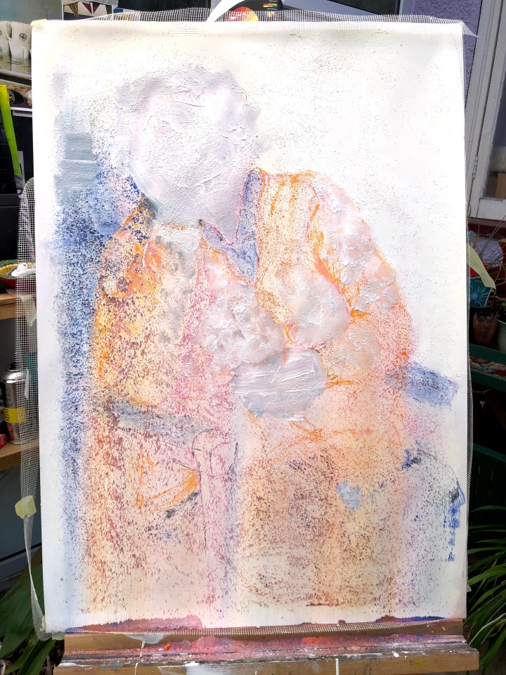
This, for better for worse, is it. I’m almost out of coloured conte and my fingers are excoriated from blending over pumice. There’s so much that could do with losing/altering/modifying but I’m actually pleased with the process. As regards best representation of the woman in the photo, I would say the pink and move pencil drawing where her slight smile and the weight of her face on her hand seems more convincing. But for technique and what I’ve learned from using a pumice/gesso layer, I’m drawn to the way line has to be lost to small points of colour – an inadvertent pointillism but with much more widely spaced dots. I like the mix of textured and flat surface so that blending has different effects in different places (for example, that patch of grey towards top left in contrast with the area below the cardigan.) Hands are still an issue for me and I’ve no idea what block gets in the way but it’s clearly one I need to address and I will, most likely, due to time constraints, after submitting this assignment. I have to move on now to the reclining figure.

***
The task asks for different supports and I’m needing to be inventive. This is black gesso over waxed edges with a layer of high gloss varnish. In this light, it looks like gold fabric with deep shadows and I’d quite like to keep that effect if possible. But for drawing I need to be able to see the surface quite clearly and so I’ll see what I can do to stretch the support and anchor it to the board.

Two pencil sketches of reclining figures, both from internet source. These are really just to get an eye for the shapes and a feel for the movement before translating one of them into the A1 piece.
This first sketch incorporates two of my horrors – hands and a slightly skewed facial profile. The foreshortened legs probably need a bit more bulk.

I like this better as a composition and series of foreshortened shapes, but also because of the need to show weight in soft surfaces. The head-to-toe angle is also unusual, if my internet search is any guide – most were conventionally horizontal in landscape orientation. Quick and loose seems to be my best technique for approximating shapes; measuring knocks my ability to prioritise perception over reproduction.

First sketch in white conte on the gesso/varnish surface. Erasing with a putty rubber is very, very easy fortunately – I need to adjust that knee* and probably also the lower foot sto keep the hidden line. Meanwhile, I have some patches of black gesso drying so that I can apply varnish and experiment with other media for some/all of the marks. I particularly want to try the bronze ink (Winsor and Newton) and maybe some oil pastels.
*Actually that whole corner needs attention.

The sunlight on the varnished gesso surface yesterday has me wondering if an under layer of yellow/bronze with incomplete dry brush strokes for the gesso might give an impression of metallic thread running through black cloth.
Some experimental work. The bronze ink looks more gold than the gold acrylic but dries slowly if at all on the varnished gesso. As an underlayer for dry brush gesso, it would make a rather fine background, but the bottle is tiny and this would be an expensive technique for a large surface. Applying it prior to the varnish doesn’t seem to be satisfactory as it smudges – unless I didn’t leave it long enough to dry.

The acrylic behaves as you’d expect – dries reliably and doesn’t mix with the layer of gesso. It has too much of an orange cast for my liking; the ink reminds me of Klimt.

The next step is to consider how to use these findings in the large drawing because, now I’ve seen what can happen, I’m quite keen to try it out. Subtly and judiciously I hope.
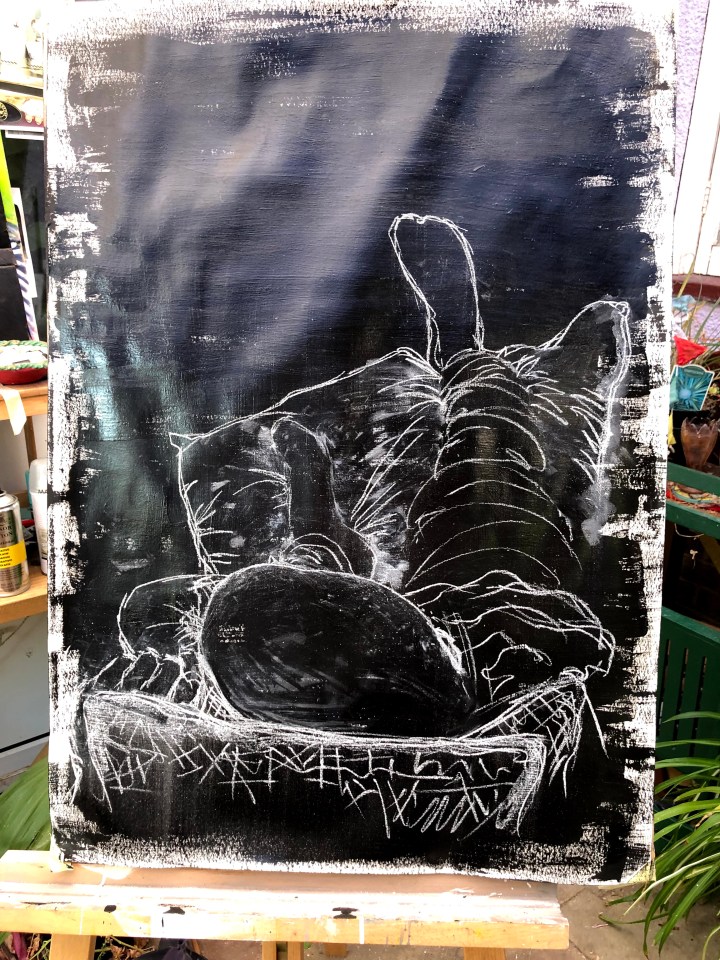
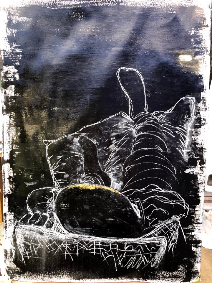
I should stop now. I may try another photograph when the light has reduced in the conservatory and isn’t shining down on the paper, although it has produced that lovely gold cast over on the left that I’m trying to replicate. I wish that had been my doing!
Although some of these are disasters and outclassed by the small sketches, I’m encouraged that I’ve been able to upscale reasonably successfully and I’ve learned a lot about different media. The first drawing, a man standing, is minimal and reductive with pastel as its primary medium. That I managed to leave empty space both outside and within the figure is an achievement for me as I’m usually driven to fill up all available space.
The second, seated, figure was a real challenge as regards settling the facial features into the person’s relaxed posture with that slight smile. I almost had it in one of the sketches and then lost it in the larger piece. On the positive side, I discovered how using a pumice mix as the first layer on the support influenced the whole approach to the drawing. Lines don’t work in the same way and this forced me into a different sort of minimalistic approach. This time something rather like pointillism where the dots of colour give rise to form from a distance. Again, I coerced myself into a situation where I couldn’t rely on lines and detail and I’m happy with the process if not the result.
The third, the reclining figure, could barely be more different, although again it’s quite minimal. This time the discovery was in the effect of varnishing black gesso and then drawing quite simple gestural lines with white conte. An unforeseen benefit was the way the light in my conservatory reflected old gold on the surface of the varnish and led to an idea about adding a touch of gold (in this case bronze ink) to the drawing. There are struggles: the bottom left area is still unsatisfactory but, to me, less unsatisfactory either than it was or how it would be if I did any more to it.
