
The brief includes straight lines, elements of perspective, and some natural objects. I’ve chosen the scene under the Shoreham flyover – an area above which roads and slip roads curve and swing, their huge struts with their feet in land used sometimes by keepers of horses but more often left to its own devices. There are other bridges in the distance, and tall shrubs between them and the concrete posts. It reminds me of a scene from Metropolis, the 1927 sci fi film directed by Fritz Lang.
My sketches are quite stark, reflecting what I now understand to be brutalist architecture but which at the time I just referred to as brutal, thinking I’d invented the term myself. This one used builder’s tape designed to keep fluid elements like plaster in place while they set but useful for texture.

They were preceded by these, another underpass covered in graffiti which influenced the stylised foliage in the foreground of the image above.

My intention is to take that first image, enlarge it to A2 size, and emphasise the contrasts between structural and more fluid natural elements.
I’ve begun by gridding, something I haven’t done before and who knew it involved dividing actual numbers by actual other numbers! This is not my forte, still I seem to have a grid and it seems to map onto my larger version. Right now, I hate it; I want to gesso-prep the surface to add a textural direction layer and I know I’m going to freak over getting the lines right. I’m essentially a Gestalt* kind of person – the whole is greater (or other, depending on who you read) than the sum of the parts – and for now this is all about parts.
*In the absence of decent accessible references, the link is to The Gestalt Centre.

These kinds of lines baffle me; I’d much prefer to take an intuitive approach and let ‘the whole’ guide my hand, but this demands really well defined structure and I do actually want that definition. The next step is surface preparation and media experiments.
So much for the straight lines! This is still just gesso, there’s time for lines.

Well, didn’t that grow up fast! Again, I’m reaping the benefits of laying down a layer of gesso with the textures I want to pull out in the next layers. Have I painted with gesso though? I’m no longer sure where preparation stops and paint starts.

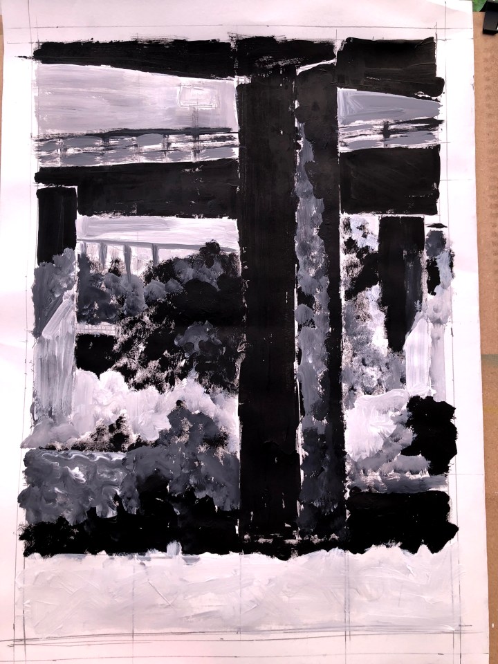
I’d argue that this is representational (figurative?) in that it’s recognisable. I’ve abstracted slightly with the graffiti-esque foliage in the foreground and the flash of white charcoal striking away and upwards from the two sunlit faces of the concrete posts. I think I’ll leave this as is for now and consider a different medium. I was reminded of Kandinsky yesterday and while I’m not intending to actually abstract this image, I do fancy placing some vibrant colour in complete juxtaposition to the nature of the actual object.
Sketchbook experimentation. Odd feeling, not having to run anything with that word in it through ethics, although Kandinsky might argue otherwise if he saw what I was doing with his ideas.

What I’ve discovered from this is that ink livens up gesso so the two become wet and blend. But not immediately – that blue dot towards the top was a surface bubble for quite a while before it burst and showered tiny dots of ink outwards, like a microscopic life form with an entourage. Some of these patches I’ve detailed with biro which occasionally becomes nothing more than a stylus, making lines with the coloured wet ink instead of its own. I like the little orange creature between the two rectangular patches at the bottom, I think that, wet on dry and no gesso, has potential. I also like the look of the blue green bird creature up towards the right at the top. That’s wet ink on semi dry gesso detailed in biro.
So, to gesso or not to gesso for this next A2 experiment? And what about the plasterer’s tape effect? Too structural? Am I going to make a butterfly of a flyover?
7th May, and I’ve gone for the colours. Born of Kandinsky, filtered by psychedelia, this is round one. Gridded as before, then major shapes outlined in oil crayon, with additional underlayer of oil crayon texture/detail, wetted then dribbled with inks on an upright board (because I can’t get it flat and there’s nowhere I can put it where it won’t have small feet in it in minutes).
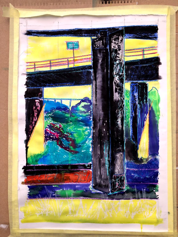
I’m intending to refine some of those lines and Tiffany a few shapes to bring them out. There’s less subtlety than in Kandinsky’s work at this stage but I might be able to add some with another layer of oil crayon, ink, and stylus work. I’ve made the sky and the bright areas of the image where sunlight catches most all the same bright yellow; now I need to pull up some shadows and foliage out of the colour.

I’ve adjusted the sky colour a little to manage distance but made the foreground foliage quite stark. I’m not sure I’m done here yet; I’ll revisit it tomorrow.
And the good news is that my new easel, which can be positioned as a flat table surface, is arriving tomorrow. The not so good news is I’ll have to assemble it and given my complete inability to read exploded diagrams and relate them to the struts and screws in the box, it could be several days and many expletives before I have it in hand.
11th May and after a short interlude sponsored by norovirus I’m embarking on a new approach. I’ve no idea where this will go yet but I’ve taped tracing paper over my drawing and pulled out some of the lines using fineliner and my magnificently massive new ruler with spirit levels that would be fab if it weren’t for the floor being on sideways.

I’m looking at this thinking I might trace out patterns from the inks and crayons underneath, not to abstract but to re-frame the structure as urban art even though it’s far from urban in its location. I was struck recently by the Extinction Rebellion tactics of bringing plants to their protests and adding natural beauty to hard city streets. After grunge and decay, is this the next wave of urban art – more scented candle than smelly detritus? Not that this would be very new; flower power did it in the 1960s and turned everything psychedelic, fluorescent, and wildly weird under ultraviolet light. We’d have to up the ecological credentials I suspect, we tried to stop the bloody whaling with Greenpeace but we wore and used plastic more than any generation before us.

12th May. Traced detail using fineliner with no attention to the whole.
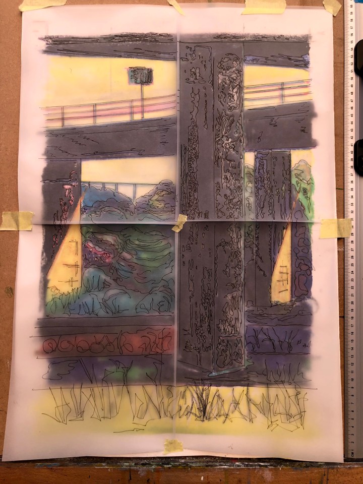
Learning points: tracing paper wrinkles when you glue it, masking tape lets tracing paper sag so the individual sheets don’t line up, masking tape also tears cheap cartridge paper. Still, here we have the detail traced from the whole but without taking account of the whole. I set them out as separate entities to further fracture the image but because of the sagging, lining the verticals up means that the edges of the sheets don’t do so. I’m going to have a think now as to how to capitalise on the slight mismatch and the wrinkles.

My new easel has been assembled with the help of my neighbour. In actuality the hardest part was getting it out of the box which really did require two of us, thereafter it was a matter of figuring out the potential behaviour of this new deckchair and finding the one hole into which a tightening screw needed to be inserted. The advantage of this easel is that it can be positioned flat and that might be handy for this next stage. It’s a bit lower than I’d imagined but I’m not statuesque, and there’s a convenient cat shelf at the bottom so I reckon it’s a win.
I’ve just relocated it and what a breeze – far easier than the leggy thing that tips and refuses to move its moveable parts on demand, and the portable one that falls over if I look at it.
Sketchbook experimentation with tracing paper, inks, fineliner, transparent gesso, and bronze enamel to see what improves the marks, what leaks, what holds its pigment.
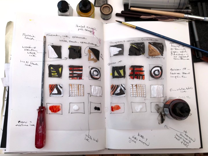
Winsor and Newton black ink holds its density better than fineliner brush; enamel applies surprisingly well on both gesso and non-gesso surfaces; inks behave pretty much the same, gesso or no gesso, but the marks on gesso seem to me to be more painterly (or drawerly, perhaps), also the flat function on the easel is brilliant. For the record it’s a Loxley Essex Studio Easel from Ken Bromley and, according to the card, carefully packed by Pauline so thank you Pauline. Now I know I can use some of these combinations on the traced elements glued to the A1 cartridge.
13th May and a Facebook OCA friend asked if the enamel would peel off. Seems not.
Application of Winsor and Newton black ink to the panels on the left and for now I’m less happy than I thought I might be. My plan is to detail these panels a little more before either repeating the black ink on the right or leaving those as they are.

14th May. I may leave this here with no added colour or further attention to the panels on the right. I quite like the imbalance, one being very heavily in your face and a tad 1960s, the other almost invisible and minimal in terms of its imposition on the eye although not its detail.
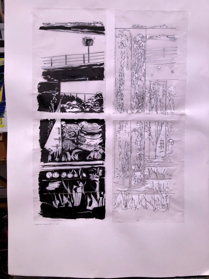
It’s clearly strayed some way from the brief of showing perspective, middle distance, and actual form; and it’s quite abstract. Also it could do with an iron and shame about the wonky signature!
I have a plan now for the actual assignment which should adhere more closely to requirements and might reflect a bit of a look at John Virtue.
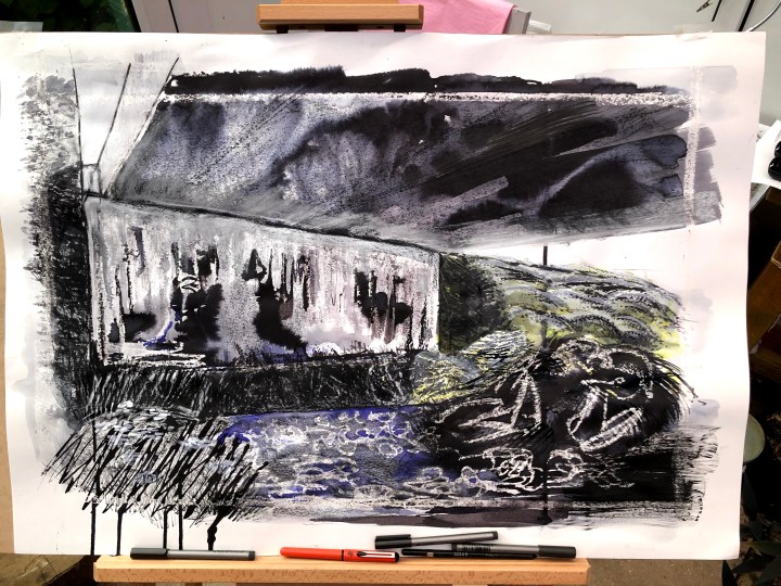
So much for the plan! This is gesso-prepped A2 cartridge with charcoal, oil crayon, and ecoline ink. I’m not sure where it’s going yet but actually seeing it onscreen gives me some ideas. No more colours but heavier black and sharp whites. There are patches of field parsley in the bottom left corner so I’m thinking of darkening that, texturing the foliage, and dotting white ink into the small drifts. As always, I had trouble with the perspective of the underside of the road. It’s a fan and I need to figure out how those angles work.

Running an image through Paintshop Pro helps try different ways of tackling the original. This is the effect of darkening/lightening some areas, using the paint brush to add darker layers, and to dot white flower heads.

15th May – some alternative adjustments using Rebelle3 software. On-board tools include charcoal, pastel, pen, pencil, blend, watercolour, and selective eraser. I’ve simplified the top left corner where removing a piece of the bridge (not advisable in real life!) improves the sense of angular(?) perspective there. I’ve also whitened the sky areas, left relatively light the bottom left, and added white flower dots and some token graffiti.

I prefer this to the previous digital version, let’s see if I can make it with actual media on the real thing. Is this ‘the piece’ though? I don’t know yet.
Back to the original now and with a layer of white/black gesso to provide texture for subsequent media, also those extended plane lines that I find strangely attractive in an architectural sort of way. I’d really like to get a dab of my new gold W&N ink onto that somewhere but might it not be a bit self-indulgent?

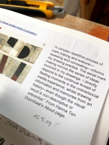
Meanwhile, discussing this in our OCA Facebook group, someone pointed me at Hanna ten Doornkaat because he was reminded of her textures in my images. Her work is abstract which mine plainly isn’t but I see what he means. She often uses board where there’s a grain in which medium is trapped – narrow trenches between peaks of less impacted surface. I think this may be the kind of thing I’m aiming for with my gesso-prepped surfaces.
Note: rather than risk breaching copyright, I screen-clip images, put them into Word docs, annotate, then stick them in my sketchbook and photograph them from an unplagiarisable angle for the blog.
Question: is this ‘drawing’ enough for a drawing course? I haven’t used any actual paint, if that matters!

Just for interest, I ran this through Rebelle software and adjusted saturation and contrast.

16th May and I’m having another go, this time on A1. I’ve waxed the margins and also areas within the image, then wet selected parts one at a time and applied wet-in-wet Ecoline ink. I’ll let this dry now and see what happens tomorrow. Lovely tilting and lie-flat easel makes so many more approaches possible.

17th May. Went in search of a YouTube video on how to paint leaves with a fan brush to help add detail to this framework and found Michael James Smith who does photorealistic landscapes. Not to my taste but there’s a technique to be had from it.
He uses oils but this is ink and water. There are some nice shapes to be made with this brush.
I think now, seeing it on screen, I want to restore the architectural feel to it – harden it off to contrast with the softer dots and wisps the fan brush has made. I’m also tempted to get rid of that overhead panel top left just as I did before. No doubt it’s integral to the bridge itself but it’s not going to fall down here and removing it will enhance the perspective. Some objects seem hell bent on not doing themselves any favours. I’m wondering too about a white ‘frame’ within the image about where the wax resist is sitting.
When you have ink left over …

Not happy with the foliage next to the concrete slab, or the tangle of bramble bottom right. Part of the problem there is my wax effort which resulted in some random marks that only became visible once inked. Learning point: draw those things out lightly first then use something a bit more versatile than a chunk of furniture wax!

I’ve signed this which means I consider it done and I either choose from the several options here as the assignment piece or I take a stab at another.
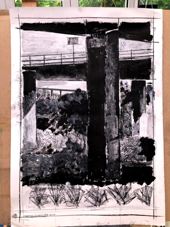
21st May and I’m writing my self evaluation without having chosen the piece to submit. From the right, this is the first drawing of what became a series. I like the formidable strength of it, the solidity, and the impact of the monochrome. Next was my ‘Kandinsky’ moment where I went for bright colours and brought out, I think, the structure as an item in a colourful environment. It’s arguably a little more abstract than the first. The third is much more abstract as I’d traced the shapes of the highlights and shadows and, in two panels filled these in with solid blocks of ink, reflecting the first image, but leaving the other two as lines. This I suspect is too abstract for the brief. The final image is an A1 version of some smaller sketches featuring another concrete structure. I liked those first sketches with their weight and raw presence but I’d gone for a lighter touch here with wax and ink and water. I’m pleased with it but again it may be too abstract for this brief.

After writing this, I have a conclusion and my choice is the first piece, the A2 monochromatic series of aerial bridges and flyovers that make up one small area under the A27 in Shoreham. It meets the brief by being largely figurative (but with some nods to abstraction in the representation of the foreground foliage as graffiti-esque marks), with clear perspective elements, and distinguishable fore/middle/background strands.
I may edit this up until it’s been submitted but not afterwards.
