This is a landscape project and I’d been considering working a bit more on my Tin Pots Hill piece but the sun came out and water is more attractive, especially down the estuary.
I find holding a sketch pad in one hand while standing to draw (and taking a seat and an easel to an outdoor venue isn’t possible) so I take photos to bring back home. In this instance, I found I preferred a panoramic view I’d taken earlier so I ran this through Paintshop Pro to reduce it to grey-scale, then manipulated the contrast for drama.
This is the original, a series of snaps on my phone that Google turned into a pano.

This is the grey-scale

And this the adjusted version

I’ve taped them onto my easel and made a sketch in conte and Fineliner under the contrast version to get a feel of the shapes. I rather fancy using black cartridge for this, adding white instead of black but if that doesn’t work, what’s lost? Nothing.


I can see the bridge to the left is at the wrong angle so that’s a thing to look out for. Can’t wait to see how this will work out!

How about that for an immediately obvious rookie mistake – the thing needs to be in widescreen, no wonder the foreground is all out of kilter. Still, it feels like a good start and I like the idea of blending and reductive drawing out of the image. Also, nice clouds!
***
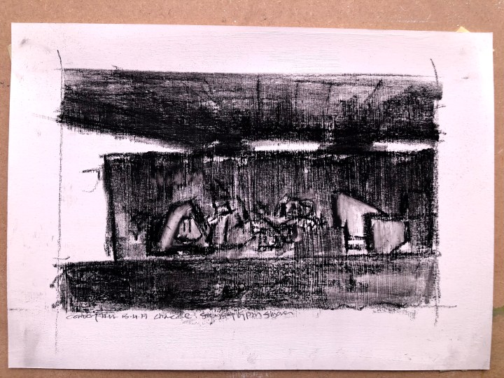
9th April and I think I’ve done with this. It was an interesting exercise but I think black on white suits the subject better. I’ve adjusted the ‘frame’ so it’s in a proportion that better reflects the photo. You just have to de-imagine the bottom half!

I’m remembering now that this is actually an exercise in composition – a task involving finding a view that makes the best or most unique image, (or maybe tells a story) and doing this by looking around using a 360 degree lighthouse search. I wonder then if I’d already done that by taking a series of photos I knew Google would turn into a pano and then abstracting shapes from it by adjusting the contrast. I’d like to think it was that intuitive.
10th April. I found another image that may (just) qualify as landscape but to me certainly qualifies as composition and drama. 
Here, I’ve mapped out the shapes in white and black gesso, and i’m thinking of using sokme pumice medium for the gravelly ground falling away from the path. I can see how artists become seduced by grungy architectural structures. Maybe it’s a reaction to prettiness.

Tomorrow, I’ll see about some new layers.
12th April. White conte, black conte blended and also dragged across the gesso texture. I’ve dropped some pumice medium down the bottom where the ground crumbles away from the path., and I’ve had a go at representing the distant background in the space on the left. That’s quite difficult and I don’t think it looks far away enough.
Not entirely happy with this but I’ll give us both a break for now. I’ve tried to push the background back a bit and it’s really not easy. The pumice medium at the bottom has made for some effective traction for the brighter stones and pebbles in the slope though.

I do like a bit of texture:


Finally, for this piece anyway, a print taken apart to let the light in.

I’ve been trying to ascertain the date of this bridge’s construction. It’s most likely the late 60s early 70s around the time the rail line was closed and the bypass was built along the old track, taking traffic out of the town centre. This bridge brought that traffic up from the coast and across the river, at first into town and then onto the new bypass. It’s a very concrete affair with lots of space for artistic endeavour, although it takes a dedicated graffiti artist to make it all the way along what’s often a boggy footpath. The other side bears the word ‘Trump’ encircled by a swarm of ‘NO NO NO’s.
Last one – charcoal on gesso-prepped A4 cartridge. I like the shapes here better, demonstrating yet again that repetition is less about refinement than movement and what can be left out.