
I’m embarking on some re-working here on tutor advice to see if I can pull the objects out of the background, which she absolutely nailed as having been applied last. Truth is, I’d run out of road and I wanted it gone in order to get some initial feedback. I’ve learned a bit since then, and I’ve also been let off the lead a little too, so I feel able to give this a better grade of attention.
I take photographs of almost everything I do, sometimes because I can pull out a detail from an otherwise mundane piece and use it elsewhere, but latterly to put a distance between me and it which enables me to see it differently. Often the blocks of light and shade seem more prominent to me, and occasionally I see a pattern that really shouldn’t be there and distracts from the whole in an unintentional (and occasionally obscene) version of the Duck/Rabbit illusion. Once you’ve seen ears (or beak), you can never see beak (or ears) again. There are worse, there were the ‘flowery’ cushion covers.
This is the original and it’s clear that the objects have been swallowed by the background. I did actually want a bit of that on the grounds that the Alien of the films was a creature that melted into shadows and was often invisible, but that was in very skilled hands and this isn’t.

Today I did some blending and reducting, and began lifting the sculpture out of its background. I was advised not to lose all the white space but I’ve taken some liberties with that in the hope of pulling it back later. I want to keep the architectural, blocky feel to it and maybe some sense of the quasi-strobe effect that frequently accompanied Alien’s scenes.

Now immediately I can see the cat is a qualitatively different drawing from the rest. Do I want that, and if so, why? It’s also sitting on a pedestal of some sort formed by a sweep of charcoal and while that seems ok for the other objects given a base in that way (Alien’s feet, the dragon egg), I’m less sure about this. I want to lift Alien out a bit more but not to bring it completely into the room; it needs to ghost in some way, to be not quite there. The three are positioned so that none is looking at another – they’re in the same space but unaware of each other at this snapshot in time. A millisecond later and that might not be the case.
Somehow, I’m seeing lines towards a vanishing point now that I can’t see in the physical article and I think I can capitalise on those.
The light source is the globe on the right and so I’ve worked to emphasise that a bit more by using the reductive technique to take back more of the charcoal in line with that directionality and darkening/blending a heavier charcoal layer over on the left. There’s some more to do with that but a question in my mind is whether or not a tiny bit of colour very specifically targeted and circumscribed might move this piece up a notch. I might just import it into Escapemotions’ Rebelle to try that out.
To be continued, (as they say) …

This feels like progress. The light is focused and I’ve taken out reflections that couldn’t possibly be there. Alien’s ‘cap’ looks rather flat as a result, and actually it is in comparison with all the nails, nuts, and bolts that make up the rest of it, but it’s not great for a composition so I’ll give it a bit more attention after I’ve looked at the whole thing upways, frontways, and sideways a few times. Elsewhere, I’ve platformed some horizontals – cat base, dragon egg base, and feet – to make a little more of the architectural roots of the film. I’ve also experimented with some very narrow diagonal lines to fragment the image slightly and I wonder if those should be stronger.
Meanwhile, chasing up Anita Taylor and William Kentridge, I found a huge number of expertly produced reductive images. For reasons of copyright, about which I’m still largely unclear and so taking a very conservative approach, I can illustrate only Taylor’s work for which I’ve taken a screen clip* that also advertises what appears to be her lecture tour/exhibition:


What strikes me first is that these are huge and I wonder how that affects ease/difficulty of the reductive process. It must require a lot of space in order to stand back far enough for perspective and objectivity, also I’d imagine, a certain amount of athleticism to make the kinds of gestural movements those pieces require. No fiddling about with tiny points there, primarily grand sweeps and a confidence in how those will work on the support.
Kentridge I’m going to deal with by photographing a printout of one of his pieces that I’ve pasted into my sketchbook.
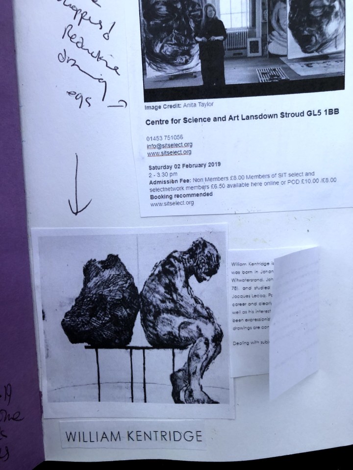
The link seems to refer to an exhibition at Leslie Sacks Gallery but I’m unable to find a date for that. This looks like quite a poignant piece, a rather unhappy sculpture sitting back-to-back with the stone out of which it was hewn, on a bench that I’m imagining is in a gallery. His background in theatre (mime and drama) and the political environment of apartheid in which he grew up seem to have informed both his work and the making of it. According to his biography:
In the inventive process by which he created his best-known works, Kentridge draws and erases with charcoal, recording his compositions at each state. He then displays a video projection of the looped images alongside their highly worked and re-worked source drawings.
This is a very active and inclusive process, letting us into the marks, the making of them, the reduction and reinstatement of them in the manner of a flip-book. These days, almost everyone has a video facility of some sort on an external device such as a phone, and some digital apps will automatically record brush strokes throughout the making of a piece. These make it possible to show how images are built, pulled apart, reconstructed, and finally completed; something only the apprentices of the Masters would have been able to see. It’s very exposing; I’d imagine you need some confidence to let people into such an intimate process. I wonder if I can find any of Kentridge’s.
Two minutes later (what did we do before Google?) and here’s this shocking animation, “History of the Main Complaint” (1996)”, in which he discusses how ‘artists draw upon tragedy as subject matter for their work and how drawing itself can be a compassionate act’. This is a screen-grab from the beginning of the animation:

It isn’t quite what I was expecting, probably because I had in mind a video of the process, not a story-telling animation, and I need to search out something more like that.
Meanwhile, back at the still life:
I’m happier now with the ‘stage’ and how that works; also the diagonals which I’ve selectively picked out underneath by rubbing away the charcoal. I’m less happy with alien’s cap and it’s hard to know how to address this because my application of fixative much earlier in the process has made reductive treatment almost impossible. Unfortunately, all my attempts at changing the way this looks on the paper have succeeded only in substituting some kind of food processor slicing blade for its more elongated carapace.

What I’d really like to do is find a way to mask that whole area and re-draw the head. Times like this I might have said, back to the drawing board, but I think I need to mull it a while and do something else while it settles.
Mulling behaviour. I’d slapped some gesso on a couple of pages in my sketchbook so they were fair game for some experimentation. The first looked just fine – like a stand of birch trees – until I sprayed fixative on it. That’s going to get further attention before it appears here. The other, white gesso on black sugar paper with black willow charcoal skimmed over it then blended with a stump, responded rather nicely to a bit of putty rubber over selected contours. It reminds me now of an aerial map, possibly of an area with multiple rivulets falling towards a sea, or maybe the far side of the moon. One day, I’m actually going to plan my gesso for a particular textural effect but for now the element of surprise feels pretty good.

So the trees have re-emerged. This is white gesso on white paper with layers of black willow charcoal applied and blended then dabbed and picked out with a putty rubber.

Again, I’m taken by the texture and need seriously to plan this in the future. I may have some more pre-prepped pages to play with before I do that though.
21st Jan. I think I may have re-worked this to the capacity of the paper.


To me, the second version is stronger and I’m happier with the background even though it could have done with more work had the support been up to it. I like the diagonals – the actual ones and the flashes that cut across the objects, and I’m more content with the cat image which now seems more consistent as a drawing with the others. I’m not happy with alien’s cap/carapace/headgear but there’s almost nowhere to go with removing/adding medium so it is what it is – very dark and something of a frill. I think I’ve learned quite a lot with this about how to apply charcoal and to be more premeditated about it (i.e. have a plan). It can be much more dense and substantial than I’d thought before looking at Kentridge and Taylor’s work, while also being capable of drawing out texture from whatever it’s applied to.
*This clip disappeared overnight. I’ve re-instated it but given other people’s reported issues of elements of their posts vanishing, I’m adding this footnote.
And now it’s duplicated. Come on WordPress, what’s your game!
