
Love a bit of consistency! [Edit: turns out this is Project 3, not 2]
This exercise is quite the opposite of the previous one in which line was paramount; this is about building up shade and tone using the flat edges of pastels and blending without too much regard for detail. This first attempt – on four pieces of A4 black sugar paper taped together at the back – uses oil pastels and also charcoals to get the feel of broad sweeps again after all that tickling the paper with pencils. Both picked up their own textures from the paper and from what must be bumps and irregularities in the supporting board, and I like the contribution that makes.
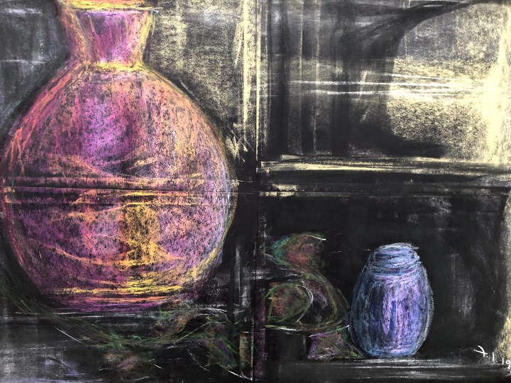

What I can see from the photo that evades me in the physical object, is that the ‘bottle’ on the left has odd shoulders and looks rounded – as in bottle shaped – when in fact it’s flat and angular, and the ivy in the centre is poorly defined. But the little tin where I keep paper clips seems to have found its form nicely. Interestingly, a ‘window’ has appeared along the joins of the paper.
As regards the two intuitively incompatible media, I wanted to use the oil pastels as a kind of batik base for the objects with the charcoal pastels making the background and being unable to affect the oils. I’ve used the long edges of each of these to make the marks, there are no lines as such beyond those created by the interaction between medium and paper. I like this but I need to take a couple more shots at it on different kinds of paper. Maybe stick to one medium this time and see how it pans out.
This exploration is entirely charcoal pastel on A2 cartridge. I’ve used an eraser to blend and the minimal background is made using just the medium residue on the eraser plus some finger smudges. I don’t really know if it meets the brief or not but it satisfies me. I have to say that one advantage of dodgy vision is that I don’t need to squint to pick up differences in tone. The downside is that the proportions are mightily wrong, although I’m not sure that worries me really, not for the purposes of this exercise. That’s it for today, I’ll take another look tomorrow as it’s not just vision that’s an issue now – the light is faded too.
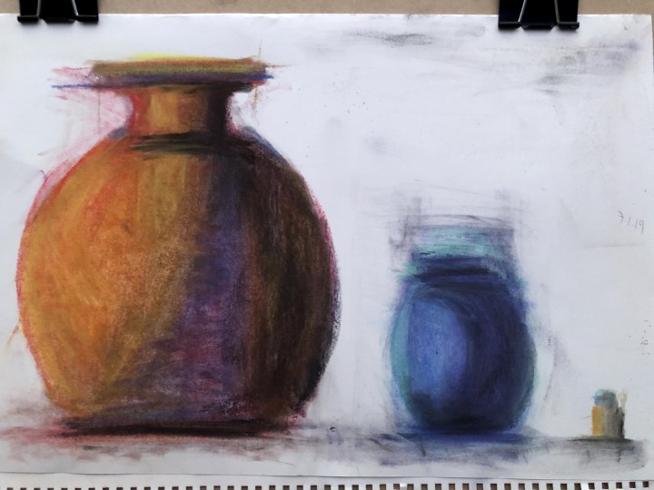
9th Jan. Another day, another shot at shade and tone.

So what have I learned from this last effort?
- Portrait orientation hasn’t made my ability to get that red vase in any better proportion
- Accuracy matters to me less than it probably should
- Smooth A1 paper is a poor vehicle for pastels/charcoals
- My eraser is a good friend
- I like mess and finger-drawing more than I’d imagined
- I won’t forget this technique because it does something unique – it stops me focusing on making linearly defined edges
- My favourite bit is that little bottle
Time to move on.
11th Jan. Not moving on. After some tutor feedback encouraging experimentation (also ‘try not to make a picture’ but let’s park that one for now!), this is what throwing acrylic gesso-prepped support [<– new word for my artist’s lexicon], pastels, oil pastels, and inks looks like in a first draft [is there a word for that?].

The white strokes down the centre are new gesso as I’d messed up (in my view) the transition between the first object and the second. When it’s dry, I can add the yellow tone with first pastel and then oil crayon. I want the tin and the little bottle to be almost suggestions, the way they would be in full sunlight when you can’t really focus on them for the brightness. The large red vase has an oriental design on it which I’ve intimated at with inks. The oil crayon layer resists the ink so it trickles down in tiny rivulets and I scraped some of those with a calligraphy pen that has teeth on the end. The gesso is both vertical and horizontal which allows for different textures to be picked out with crayon media. I’ll come back to it tomorrow, meanwhile this is what happens when an online seller sends you an unsealed bottle of lippy and doesn’t want it back.

The dark blue is NYX Moscow, the rest pastels. I’ve discovered I like smudging the outlines as if the objects are moving. Which they are, at whatever the speed of rotation of the earth, the earth around the sun, and the sun around the centre of the galaxy adds up to.
Turns out this last bit is Exercise 3. I used to be able to count.
