
After faffing around with what might be called drafts, I’ve realised that only a couple meet the criteria for Part 2 Project 1 by being akin to compositions. I’ve posted them already but with multiple others that aren’t part of that set so now they’re here.
This is honestly one of the most unimaginative compositions (to me, anyway) that I could have inflicted on myself and it shows. I used charcoal to render a basket filled with pebbles and a glass of water with cress from my pond. The result was even less attractive than the arrangement and, my the time I’d taken the photo, it had further been smudged and fudged to oblivion. I’d hate to say deliberately but …

I liked this better. It’s one of the pebbles but it has its own components of surface and troughs. I kept thinking of the Mars landers and imagining this as a planetary surface full of craters and cracks, spilling minerals out of volcanic fissures. I found myself looking at adding texture to it with paper towel roll pasted on using PVA glue, then inked and, when it was dry, scrubbing over it with oil pastel (final image below). I’ve also positioned it almost as a 2D object with a deep shadow which is perhaps more redolent of a lunar object than a martian one.


I like the textures the paper and the hardened PVA made and that the crayon brought out. It does remind me of a hedgehog though!
***
Shells and a xmas cactus. On the principle that doing more of what you can’t do is a good thing, I tackled some shells using fineliner. Such a long way to go with these.

I had a fineliner rebellion and resorted to using conte dust on one finger for this xmas cactus. Strangely, I found I was ‘drawing’ with my right hand instead of my left, so it was a true rejection of the previously controlled method and medium. I also found it more satisfying. Maybe I like suggestion more than definition in art, a complete contrast to my needs as a scientist.

***
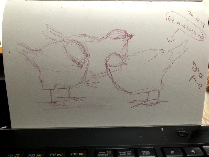
This is my Birds series. My sister bought me these for Christmas, which was quite a surprise to both of us as I’d bought her the same. Only one though, so I’m in bird debt.
I began using pencil and aiming for the detail in the birds’ surfaces but found it was shape and movement that took my attention. They are so life-like but also so mercifully still!


Thinking more about shape and movement than detail, I tried then for a lighter touch using a coloured pencil, changing the positions of the birds so that I didn’t begin drawing what I remembered seeing rather than what I could actually see. I think this simplification works although the bird on the right is a little unbalanced. The arrangement is clearly central but I considered how the three could make their own negative spaces amongst themselves, much as living birds do – tolerating closeness but not encroaching on each other’s feeding territory.
Another arrangement, again to look at balance. This one has a more vertical aspect to it.
Nothing like a good scrub with a conte crayon! I did enjoy doing this – it was quick and free and most likely benefits from the tighter, more constrained efforts that went before. I felt I had a more natural ‘swing’ to the stroke gestures this time and I wouldn’t have had that without those preceding drawings.

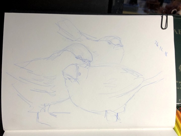
This time, having had my fun with conte and made some looser shapes, I wanted to see if I could bring this into a tighter medium so I used pencil for a light outline guide, then fineliner, watercolour pencil, and a fineliner finish with the crosshatch shading. I thought also I needed to draw at least one bird from a completely different angle with the result that all of them seem to be focusing away from me, the observer.

***
More individual items.
This is a metal watering can in the shape of a cockerel. For some reason, I found it difficult to get all of it on the page. In. Every. Single. Sketch. This is the first; conte on A5 paper.

Here’s the second attempt; still no handle, just a couple of indications. Does that matter though? I began to see it more as ‘cockerel’ than watering instrument, and a bit like a Regimental Sergeant Major, gearing up to give some Private a hard time!

This is what I have to put up with.

Finally, something that begins to look as though it might be metal and even though it’s somewhat curtailed top and sides, I like how it’s turned out. Smudging and erasing makes quite decent highlights, and sharpened conte crayon makes nice sharp lines for definition.

Concrete cat. This was the heaviest present I’d had – a concrete cat that looks as though it was cast from a mould although I really hope not. I thought it would be easy, given my household, but no. The problem, as always, was drawing what I knew about cats and not looking at this beast in front of me. Still …

After the initial attempt with blue crayon, aiming at getting some shape from my model, I resorted to charcoal for a looser approach. Dear me, not quite what I’d hoped from that and very much an over-kill of medium as a means of hiding rubbish bits of form.

Ok. This was more about finding the movement in the sculpture/statue/cat-cast. I’d prepped the pages with acrylic gesso and the effect I think, is rather pleasing. Like linen. The top drawing is black conte with blue charcoal for no good reason other than to see what colour would do to the overall impression. It has an abstract feel to it now.
For the bottom image, I drew the cat occupying my keyboard and too a minimalist approach. Couple of sweeps with conte crayon then leave it alone. Again, the gesso delivers an interesting texture and I like the sense of movement in the whole. It doesn’t look like her but we’ll keep that between us, right?

And back to the concrete cat after experimenting with those different ways of making shape, form, and movement where there is none. I did this with conte dust on my finger – oddly using my right hand, which surprised me when I noticed. The finer lines I did with my left hand – more control, precision. I wonder if it was the pre-schooler who took over there for a moment. Whatever, I’m much more satisfied with this as a representation of the actual object. It’s a hooray moment.

