
Feeling somewhat directionless with regard to research, I decided to make a start by thinking local – galleries within a short driving distance where I could go and look at art work without the difficulties inherent in lengthier travel. My search brought up a surprising number, some of them even within walking distance of each other and many featuring both local and national/international artists.
This first ‘hit’ is from The Cloud Gallery which has branches in Chichester, Worthing, Brighton, and Horsham. It’s a painting by Dairo Vargas, a Columbian artist who graduated in 2008 from the Kensington and Chelsea College of Art. As it’s on sale at the gallery and I’m including contact details, I’m hoping this doesn’t breach fair use rules.

I’ve watched enough Landscape/Portrait Artist of the Year series’ now to know that I’m always drawn to this kind of blocky, fragmented style while also harbouring a sneaky feeling that it might be a cheap trick to avoid technical accuracy. Then I have to consider that, avoidance or not, it’s neither a trick nor is it cheap because, if it were, I’d find it easy(er) to replicate and I don’t. I like the way it seems to make the shapes while specifically not making the shapes, relying on what we as observers know to be there in terms of the concept of ‘face’. Our brains make the shapes so, to create the patterns our brains can use to do that, has to be a very clever and insightful process.
***
Also from the Cloud Gallery is David Henty, “now considered the world’s best art forger/copyist. He has considerable expertise in convincing the viewer and art experts, having mastered the techniques and idiosyncrasies of some of the most iconic artists.”
I’m not sure I have too many qualms about clipping from his list as he’s already ‘clipped’ from many other people’s! This is one of his ‘Lowry’s which I was interested in because it looked like a Lowry – at least initially. I like Lowry’s so-called naive style and this replicates that. There’s clarity in the simplicity, which is so different from the blocky style that relies on world knowledge to make sense of, in that you don’t have to know too much about what people look like, or buildings, to know what’s being represented. To say these are like drawings for children sounds like an insult and I don’t mean it as such, but to my mind there are clear similarities.

***
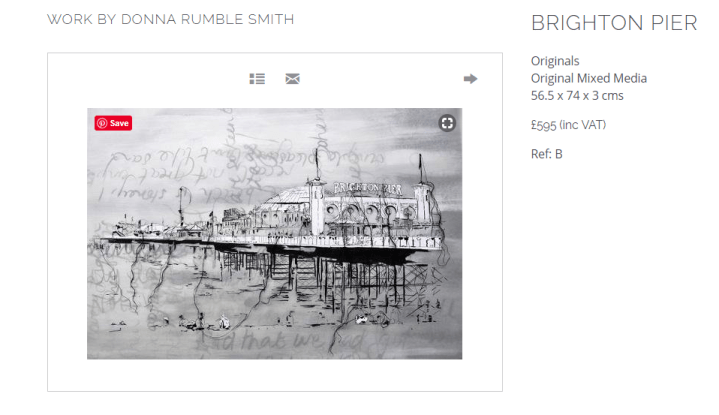
These fascinate me. Donna Rumble Smith “explores line through ink and stitch sketches of places visited. Her career in embroidered fine art textiles has brought together her interest in the majestic structures of architecture and machine stitch“. Stitch! I love the simplicity of this work too, but it seems more refined, more conceptual than Henty’s Lowry style. It’s spare – something I find hard to allow – and fine tuned, like tracery. I’m a sucker for a good pier too, and this one’s both architectural and also a wee bit Brighton-scrambled; slightly out of line, a bit renegade in its attitude. It won’t dissolve and drip down over its struts, but it doesn’t look as though it’s entirely inanimate. Good old Brighton.
***
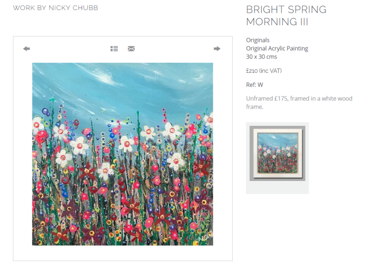
I wasn’t surprised to find that Nicky Chubb trained as a designer and textiles artist. These pieces remind me of the abstract impressionistic fabrics Habitat was awash with in the 1970s. I’m attracted by the colour and the clutter of it, even though it’s predominately a broad border of vertical lines with a swirl of sky (or water; probably not water) above that’s painted as if it’s one of those 360 degree shots where the world disappears off the edge of some digital universe.
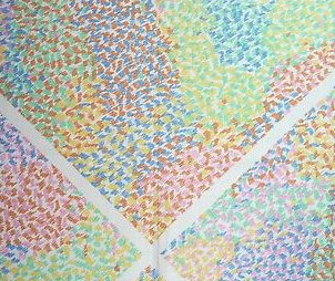
This piece of fabric was on eBay and listed as sold. I may still have some somewhere. Clearly, Chubb’s paintings are much more representational, more definitive as objects, but I don’t think it’s too much of a leap to see them as fabric pieces. I have a local artist friend who makes similar pieces and I’ve often thought to suggest moving them into fabrics. I’m not sure if she might find that a little insulting though – Nice painting, have you thought about cushion covers? Not everyone would be flattered.
***
So that’s four different styles and ways of working, all of which interest my eye but for different compositional and technical reasons, and which reflect in part the hotch-potch of approaches I’ve employed in my own work. Here are two examples, the first based on a poem by Marianne Moore which remarks in the first verse that Durer would have seen a reason for living in a town like this, with eight stranded whales to look at, and the second the product of a workshop on trees and light:
The whales began as an A4 exercise in ink drawing but, due to lack of restraint, gradually became a mixed media piece with acrylic, watercolour pencil, and a collaged reference to the poem. The second is a 12″x16″ canvas board painting made entirely in acrylics ladelled on with a palette knife. I’d done a paint sketch earlier using a rough pumice medium, for no good reason, really, other than it was weighty and interesting, but that gave me the leaning towards paint that has a third dimension of this piece. I enjoyed both, one as my vestigial Beardsley, the other as whatever it is that’s coming next.
Note: I’ve set Stranded Whales as the featured image to avoid WordPress randomly choosing one of the pieces I don’t own.
