
7th December. I’m in a weird parallel world set where one strand has things I’ve drawn selling in a gallery, and the other is littered with sketchbook pages full of lines that won’t do as they’re told. So …
- I read the instructions in the course folder again and again frightened the daylights out of myself.
- I prevaricated, deploying the ‘essential research’ tactic. That would have been good if I’d stuck to the brief but there was the John Berger Ways of Seeing rabbit hole, and the meerkat warren of a Google search for still life images to contend with.
- Eventually I hit the conte and tried to drag a composition out of the scene most frequently in front of me.
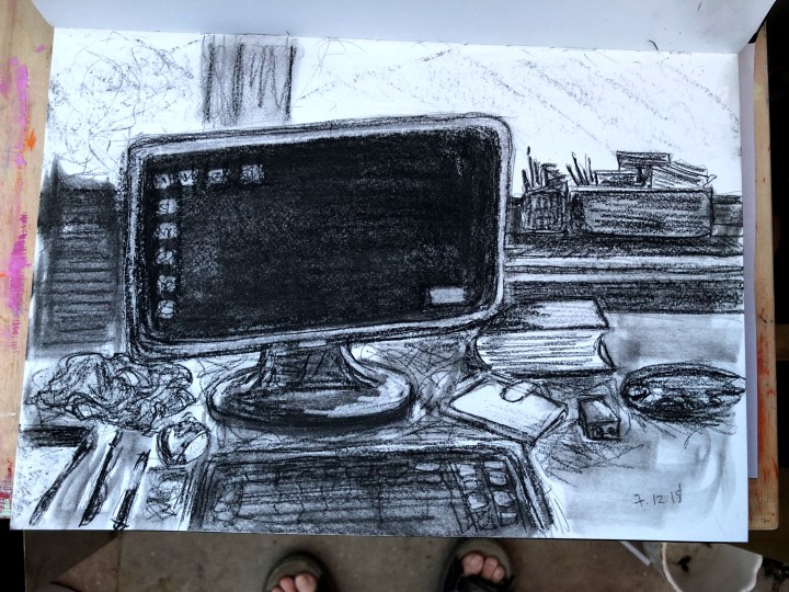
I made a rough sketch in pencil first for the shapes and positions, then scrubbed over it with conte. I use stumps for blending and smoothing and a battery operated eraser to pull out highlights. It can be hard to keep on track with that and sometimes it runs away along an edge, but that’s remediable with another set of conte lines. The screen is black whereas it actually has images (desktop wallpaper) and icons all over it. Keeping it black gave me the idea for the next iteration.

This is a much simplified version of the sketch whereby all the items are scrunched up in a tumble at the bottom of the page with emptiness all around. The colour comes from collage pieces taken from screenshots of news and political items that have crossed my path lately. The blue is from Forensic Architecture’s investigation of the ‘Left To Die Boat’ full of migrants who were seen, known about, but not rescued. Many died. The red strips are also from an investigation by Forensic Architecture, this time of the disappearance and murder of student protesters from an Ayotzinapa college. The lines are the timelines of the students, police, and bad actors.
I used blue on the screen because it resonates at a very facile level with the Blue Screen of Death Windows users are familiar with, and pulls together the way our technology brings deep and desperate issues to our desks, along with the trivia and so-called first world problems. The strips of colour taken from the Ayotzinapa graphic seemed to me right for the role of moving information from screen to book. Or maybe they don’t, maybe they stop at the screen and fall off.
Grenfell is a third Forensic Architecture investigation and I’ve use clips from that screenshot on the drawn screen and again on the keyboard. It’s fractured as has been the society so dreadfully caught up in it, and the politics and services that failed them.
I’ve also clipped Trump and a small crowd – whether they were angry or baffled isn’t clear from the image, but these seem to be the prevailing emotions – for me at least – when I see anything to do with him. Also there, and not unrelated to Trump, is the face of a female nude and, lower down her arm and breast, taken from John Berger’s video appraisal of the subjugated role of women in art.
I’ve used the Ayotzinapa lines as the sun, shedding light on complex issues but none at all on the screen.


Top left: from the John Berger documentary; top right: Facebook newsfeed featuring Trump and a group of people; centre left: Forensic Architecture’s ‘Left To Die Boat’ tracking imagery; centre right: the Ayotzinapa students’ and others’ time lines; bottom: Grenfell tower.
There’s a cat in the collage version, just behind the monitor this time. The internet is full of cats; you can skip in a click from death, torture, and sexual assault to compilations of kittens ambushing dogs. Does this make us vacuous, avoidant of difficult issues, or are there so many more difficult issues right in our faces such that avoidance is self-preserving?
This isn’t finished – or I believe it isn’t. I want to add some ruled black pen lines in places, and maybe some ink colour in the screen. Fire maybe, or chlorine gas? Learning when to stop and, for me certainly, leaving empty space empty is going to be a challenge.
To be continued …
8th December. To help with seeing negative space, I imported the two drawings into Paint Shop Pro and converted them to negatives. While this isn’t exactly what’s meant by negative space, I thought it might just change my perception of the whole by reframing it. The conte version on the left looks quite ghostly and almost illuminated, while the collage has made new colours. At the moment, I’m finding the first more appealing – becoming negative seems to have upped its game as I prefer the collage in its original form but consider it a bit flat in this one. I’m going to have a think about how to think about these but for now, there’s a Christmas tree to assemble.


9th December. I may do something with those negatives at some point but, for now, the original is on my mind. I wanted to add detail but not to fill that white space because, for me, it represents the chasm between our digital and our physical environments. I value both but I know some people get lost and upset and distressed by the amount of information coming at them through every device. Separation (and an end to multi-tasking for me – stopping that urge to check my phone or iPad to see what’s come in while I’ve been watching a whole 10 minutes of TV) is likely to be important in managing overload, so that space is essential. Anyway, at the risk of over-analysing what’s essentially a sketch, I’ve added some binary strings (and please, programming people, don’t go making something out of them because, unless I’ve been possessed, they’re as random as a human can generate – which is not very!). The ones along the bottom of the screen use the Ayotzinapa timelines as a staff with musical notes across it. The ink colour represents the gases and fires of war and that billowed around the Grenfell residents. The edges are deliberately extended outwards as lines as a way of blurring the digital and physical worlds, but the clear lines of the window and the sun are the stabilities that frame it all.

That’s probably enough of that, I’m running before I can walk so I took this down and got the sketch pad out for some drawing practice. Here endeth.
