
Begun 28th June, reporting 5th July 2025. This is Lancing seafront where a promenade emerges from behind some flats at one end and disappears into the far distance at the other. The beach is all pebbles and shingle except on the rare occasions of a very low tide when something gritty is exposed and passes for a beach. The promenade is exposed, the high tides can be ferocious, and the weather systems are spectacular.
The photograph I’m using here faces west towards Brighton, which is along the coast, appropriately around the bend. Noisy and blingy, Eastbourne to the east and Worthing to the west wish it would just sit down and be quiet for a while and I hope it never does!
I use Blink cameras to capture short bursts of activity, usually of foxes and hedgehogs in my garden but also sometimes of the ‘wildlife’ in my studio going about its business.
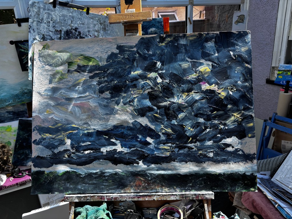
The first video shows it began life as an orange wash of cloud shapes but then, like most of my pieces, rapidly became something else as imagination took over from the frozen reality of the photo. I’ve seen many weather systems there because the horizon is low and long and the sky seems to stretch over the promenade and low buildings at the edge of the coastline. Bright sunshine at one end or on one side, deep dark roiling thunder clouds on the other.

At this point, I had a Bowie-esque series of orange flashes in the sky, and true to form, I like it better now than I did then. Trust me, it didn’t look this good in reality!
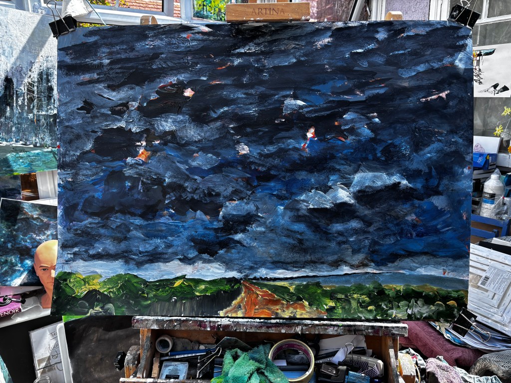


Here, in frustration over the composition, I built a massive, blocky thunder cloud into most of the right quadrant. I wasn’t keen on it but it changed the nature of the painting and gave me a new direction.

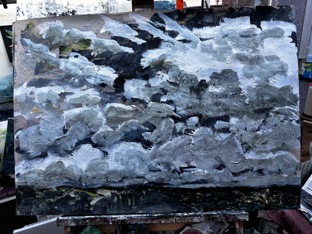
So here’s my familiar skyscape – low-lying horizon and a massive sky, which is actually how much of the landscape locally looks. I struggled with that path, and not for the first time, because of its central position and the fact that it either disappears into its own vanishing point or turns a bend, narrowing precipitously before it does. I darkened it using my artistic licence, learner grade, and let it blend into the dark foliage either side which goes down to the main road (left) or the beach (right). It’s typical of coastal vegetation; hardy and scrubby.

There’s a fence along the left which I soon dispensed with because it added nothing and detracted from the simpler lines of the path. By this time I’d imagined a storm brewing over the sea and encroaching on the sunnier sky over the land, and then I could see a battle front between the two. My problem now is that I like the effect of the yellow (Naples and Burnt Sienna) on the clouds on the left and the highlights that have come from that. But I have heavy rain coming from the low clouds on the right so I need to tackle that differently. Significantly, I’d used a much smaller brush to up-paint those clouds and so perhaps that’s the answer but with storm colours.

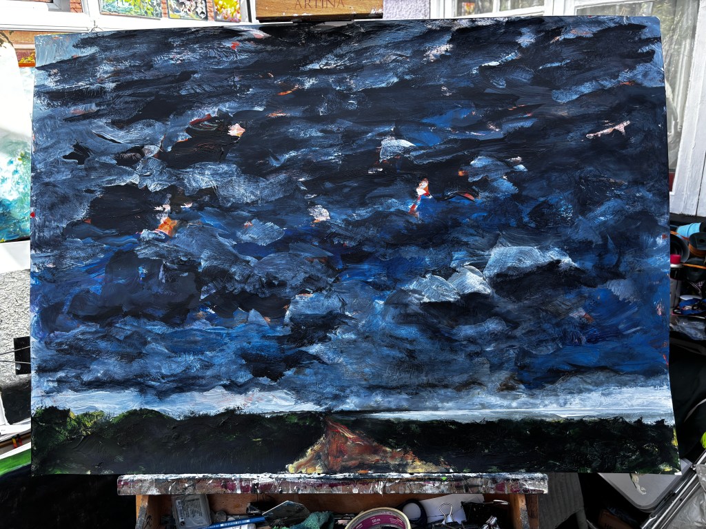
Note: clouds are inherently daft, randomised, meteorological events that have no permanence. I’ve seen massive examples that seem to fill the sky from top to bottom, but only on one side of it; and I’ve seen what looked like a row of six identical sheep parading across the horizon. I could probably get away with painting the first but not the second!

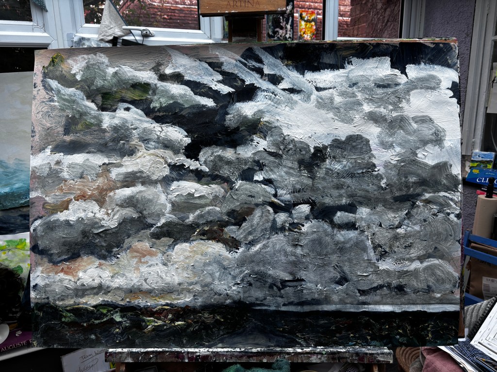


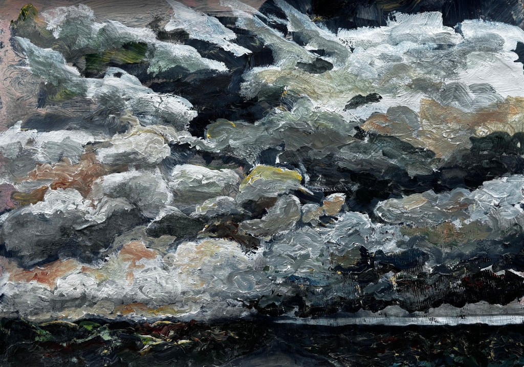


This is the best photo I can get at the moment. It’s giving my camera a real headache with its distribution of light and dark and that’s without the changes in light falling on it. I was faffing about trying to show the rain that often comes in visibly on the edge of these storms and painted in some heavy-bottomed clouds while I was thinking about it. I’m not looking for replication, my aim is more representational, slightly abstracted but not so much that it’s unrecognisable. If a viewer ‘feels’ the storm without needing more precise information, then this is a win for me. I finally made the rain with a comb dragged through the wet paint above and I’m more than happy with its drama, its unnaturally straight and spaced lines, and the feeling I get from it that those might be iron railings.

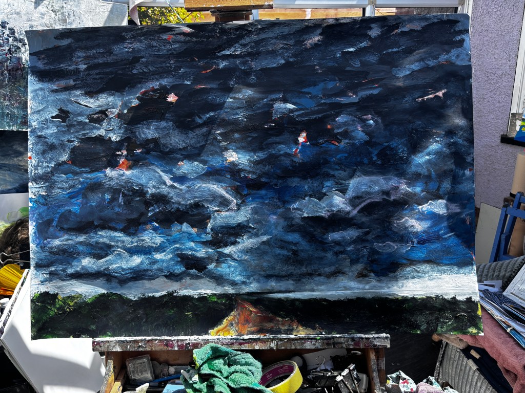
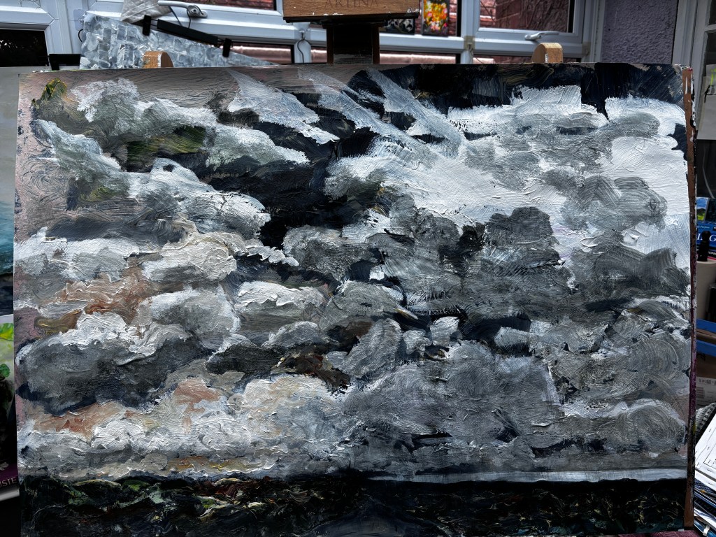
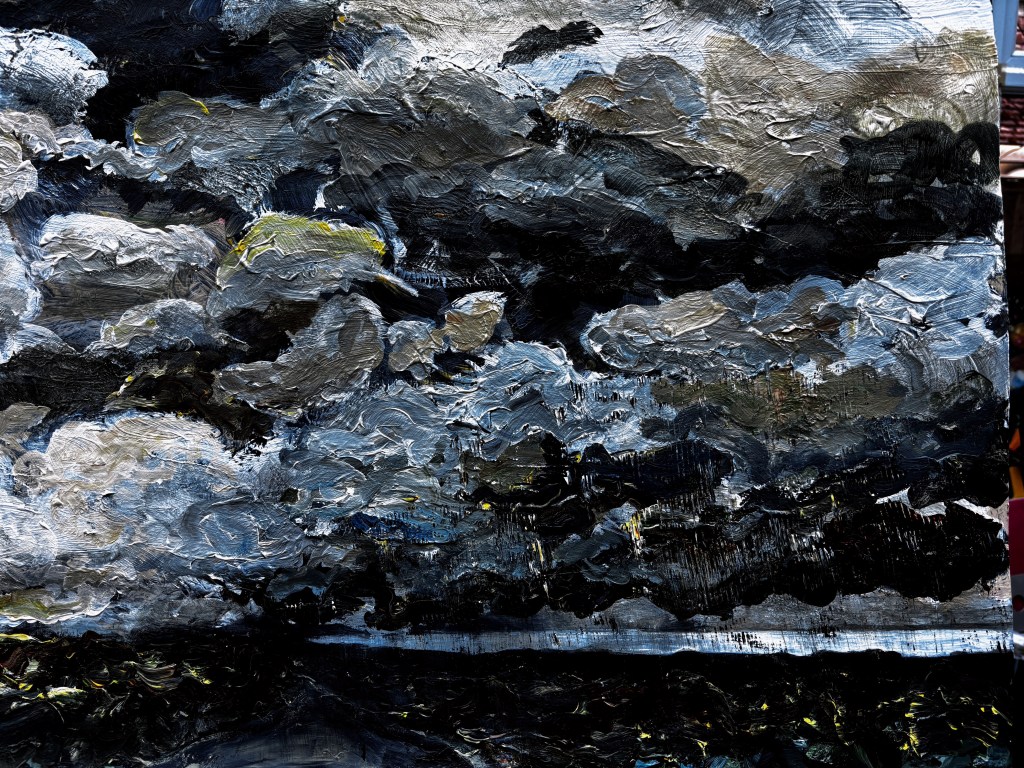
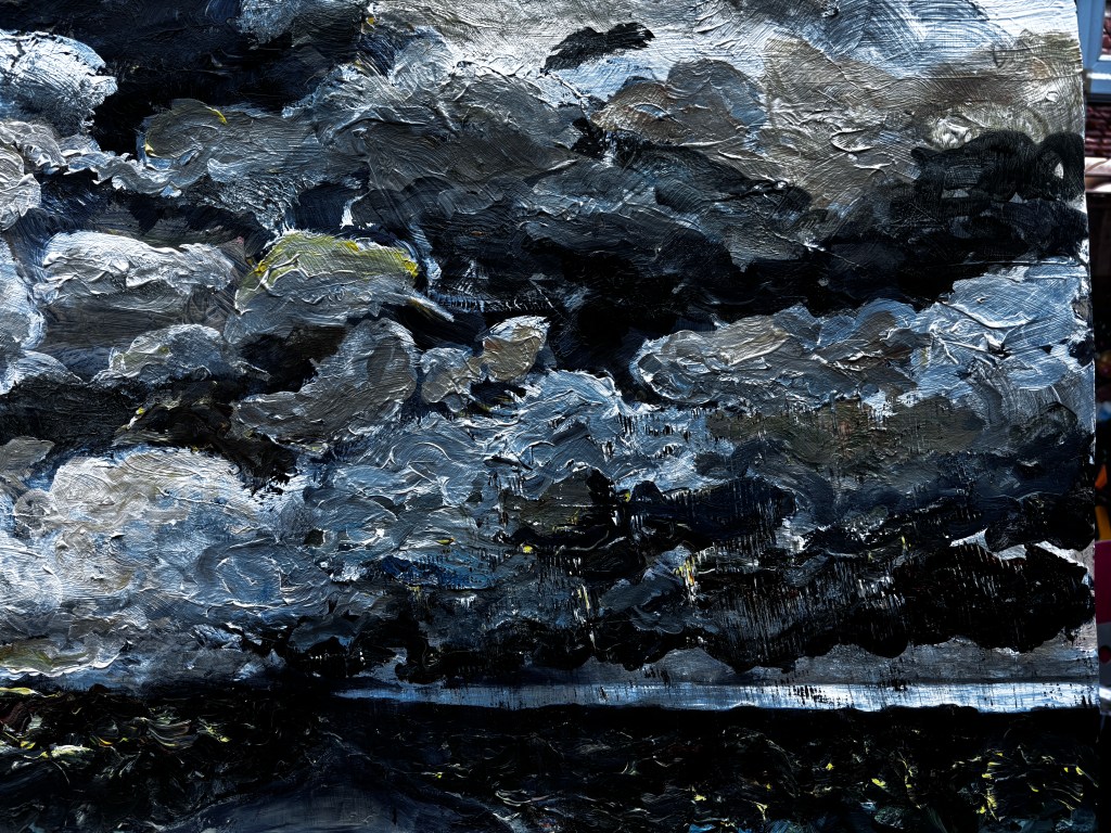
This is better although a crop is going to take off some edges more than others.
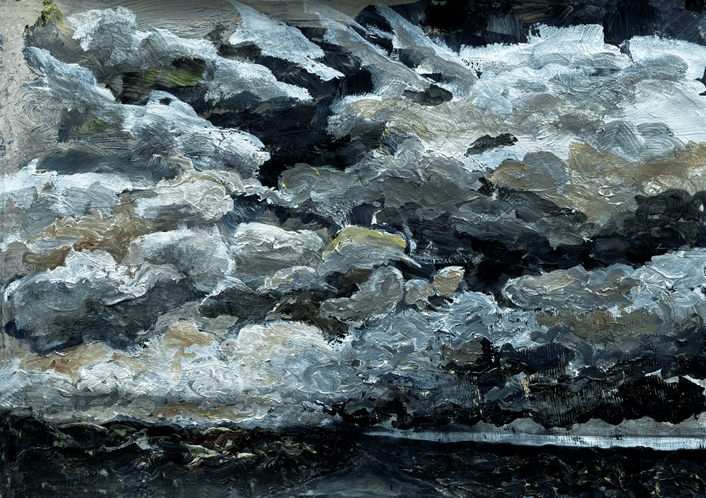
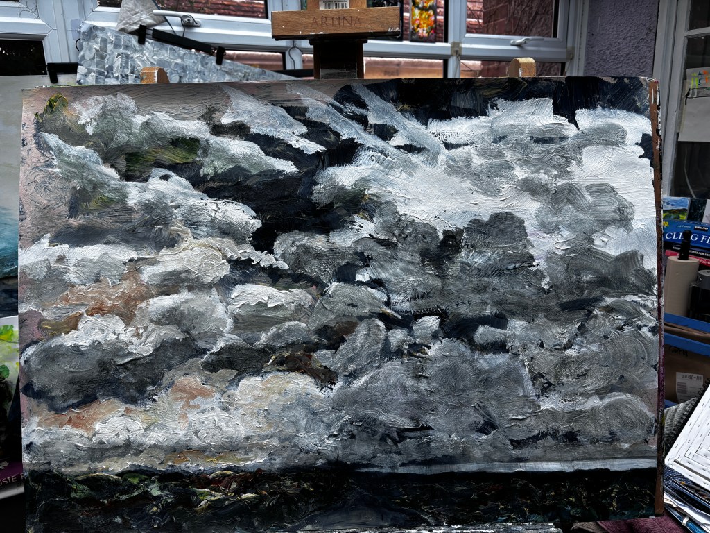
This is the cropped version. I use Paintshop Pro to do this and to tidy up the edges with the cloning tool which allows me to pick up paint from nearby an untidy edge and fill it almost seamlessly.
All elements (c) Suzanne Conboy-Hill 2025
