This task asks for a study of a corner of a room at different times of day. Interiors have, historically, been a staple of the painter’s repertoire, often as background to figurative work such as portraits or the pre-photography equivalent of an Instagram post – here we all are, look at our clothes, the curtains, the food on the table. Two always come to mind, the first that enormous piece of work by Velasquez of the King of Spain’s family, household, dog, and curiously Velasquez himself with possibly the King and Queen reflected in a tiny mirror at the back. It’s a posed piece and because of that, quite hard to imagine it being painted live. Did Velasquez make individual studies of his subjects using a camera device and paint them into the composition? To me, this wouldn’t lessen the grandeur of the image, it still takes considerable skill to make those kinds of transitions of scale and perspective, and it gives us detail we may not otherwise have had.
Diego Velasquez 1599-1660
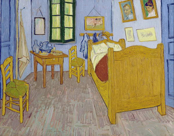
Van Gogh, on the other hand, delivered a colourful but stark interior full of light and almost graphical in its technique. The perspective is interpretive, not architectural, and the items seem arranged so we can see them. It’s an odd combination of naturalism and constructed impression. van Gogh isn’t in the image and my sense is that this was painted live and more than once. The version below is from 1889 (via Bridgeman Educational)
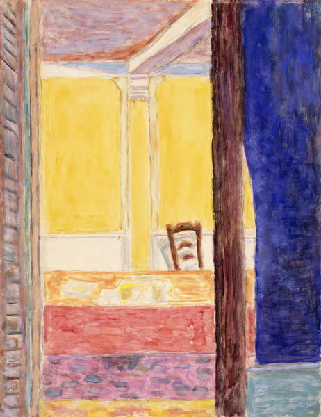
Eight Essentials to Know About Pierre Bonnard – List | Tate. This is a handy guide, important to me because he is not who I was thinking of at all*. Bonnard’s paintings of interiors are very domestic and use a kind of primitive perspective that shows us whole surfaces that shouldn’t be completely visible. This painting – House of the Painter near Cannet (1945) – doesn’t quite illustrate that quality but does reflect for me the style that is rather loose and maybe a tad naïve. I’m not sure I like it very much.
Pierre Bonnard 1867-1947.
: : leemaelzer Lee Maelzer 1964- This body of recent work is fascinating because it could have been made by two different people. Some of it is very impressionistic and impasto but the other grouping is smooth, almost graphical, and with a hint of outline to many of the elements. And although the subject matter of the first group is very domestic – tables, food, hands, sinks and so on – I really like the style, the brushwork with its rough simplicity, and the rich palette. The other group is ogten making some kind of social commentary – Heavy Rain for instance which shows rough hewn rocks falling from the sky onto a suburban street and has me wondering how related this is to the nuclear industry and heavy water. Between Kim Baker and Lee Maelzer, I may have found my more aspirational imagery and content. I’d add a touch of Mimei Thompson though, mostly for the cheekiness of that dead fly.
Contemporary Painter | Hayley Field Artist 1967- I still find abstract art difficult to navigate without some insight from the maker as to what the works are about so these really don’t inspire me. I find them forgettable.
Walter Richard Sickert 1860–1942 | Tate 1860-1942. Sickert seems to have been a bit of a wide boy, mixing with the ‘celebs’ of the day and presumably hustling his brand with his eccentricity possibly derived from or at least enhanced by his theatrical experience. But for a flamboyant gadfly, his paintings are unexpectedly dour and really rather lifeless. I can appreciate the skill of their execution but I don’t find them attractive for either their content or their visual impact.
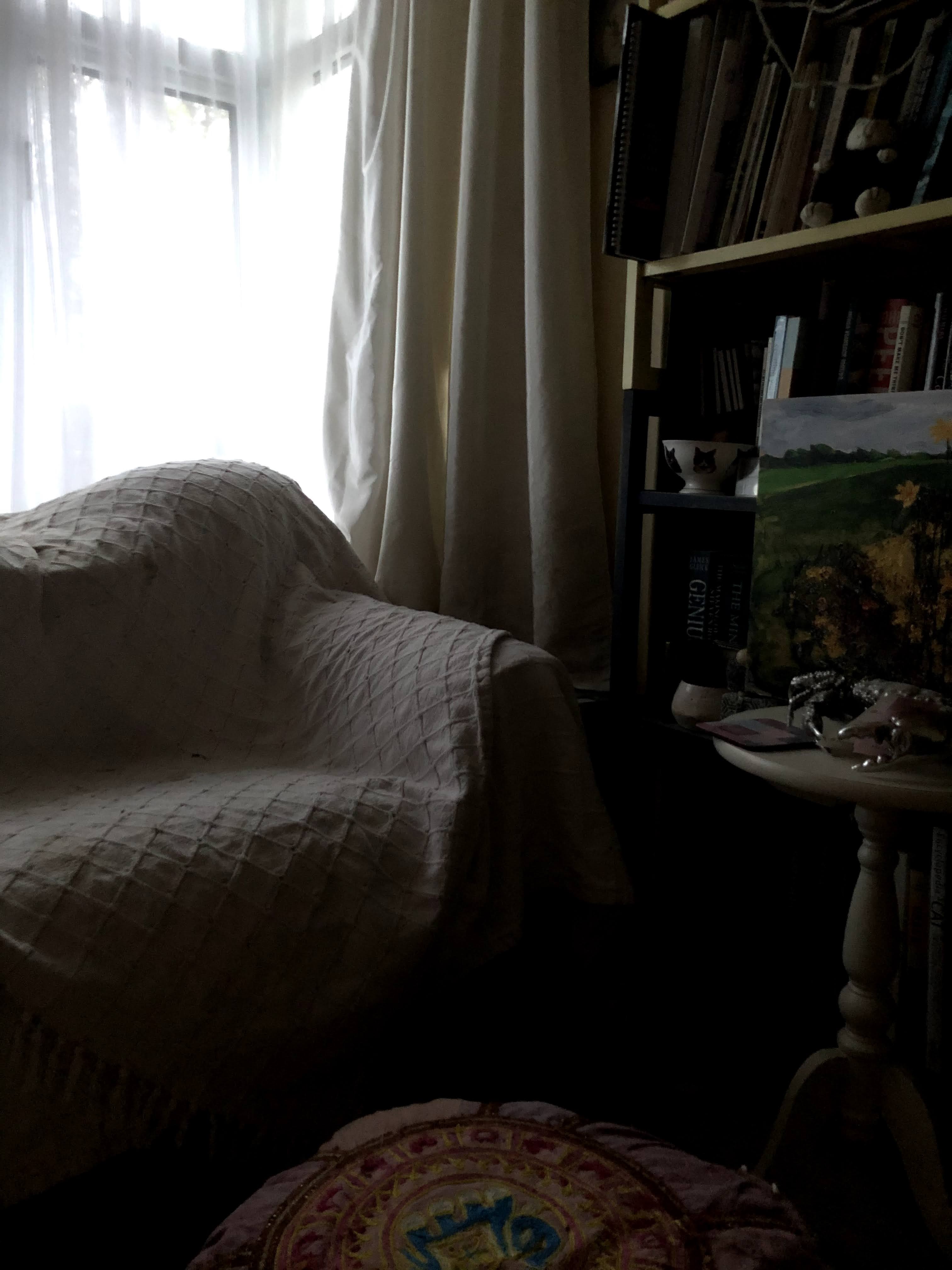
So, to the task which asks for a study of a corner of a room at different times of day. Theoretically these would be when the light changes but at this time of year and with prolonged dullness in the air, this hasn’t happened for some time. I was puzzling how to accomplish this; to meet the requirements but also make something that pleased me as a piece of work – what about three pieces with hints of imagined variety of illumination? Or mounted as a flip book to bring out the slight contrasts as movement? Or even one base on cartridge and two on film?
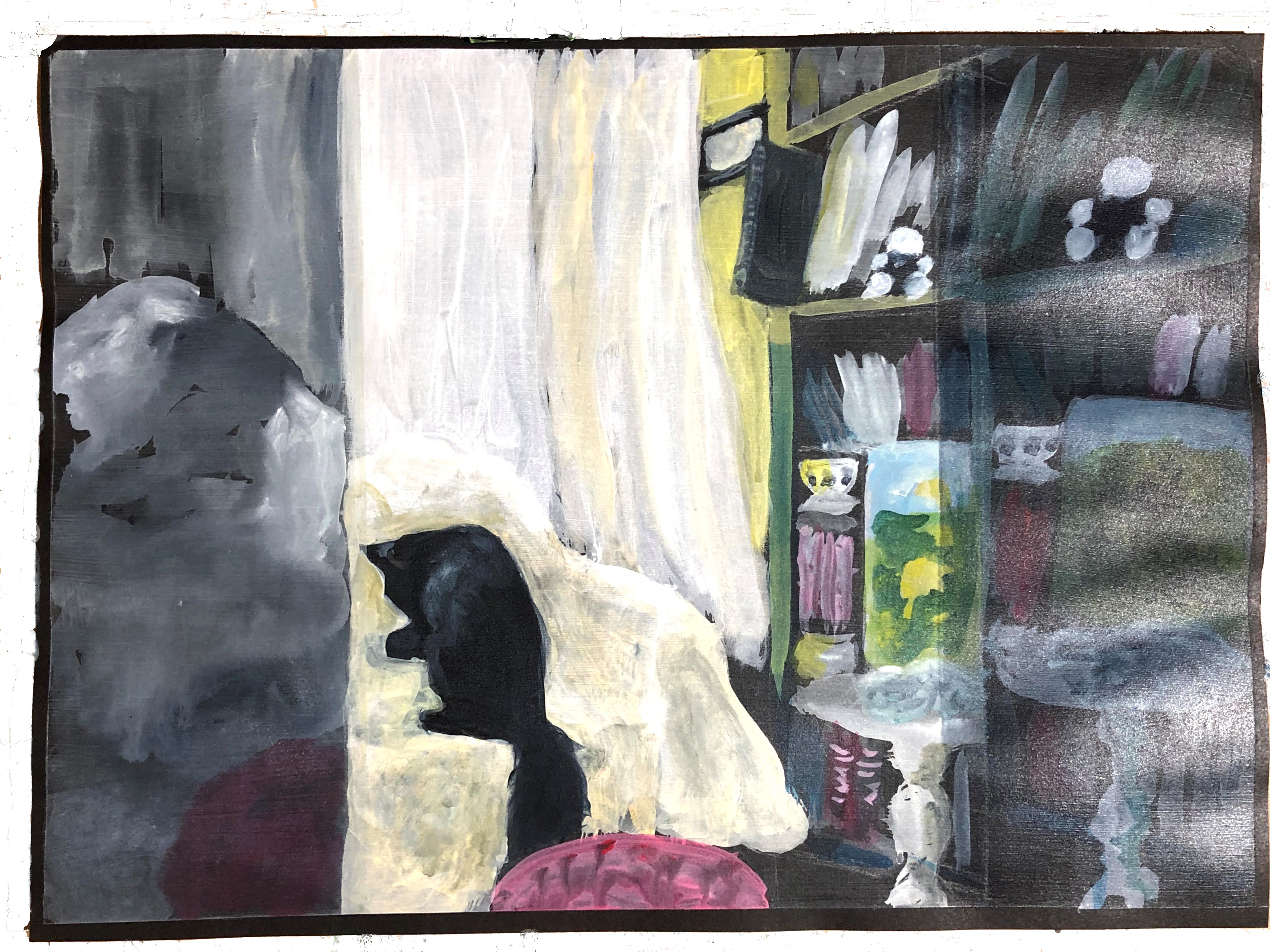
In the event, I found myself idling through the samples of Painting 2 which, should I get through this level, will be my next step. And what a step! Terrifying and exciting in their range, freedoms, and expectations. Lots of questions about how and where and with what – none of them insurmountable because inventive creativity is at the core. An idea I was left with, and I’m not sure where it came from but I suspect it has more to do with approach than an illustrated technique, was to make one painting of the three scenes – rather like a triptych with midday in the centre and the two darker images either side and all slightly off the angle and perspective of its neighbour. A fragmented piece that could be three pieces put together like a broken stained glass window that the mender didn’t really know the original layout of.
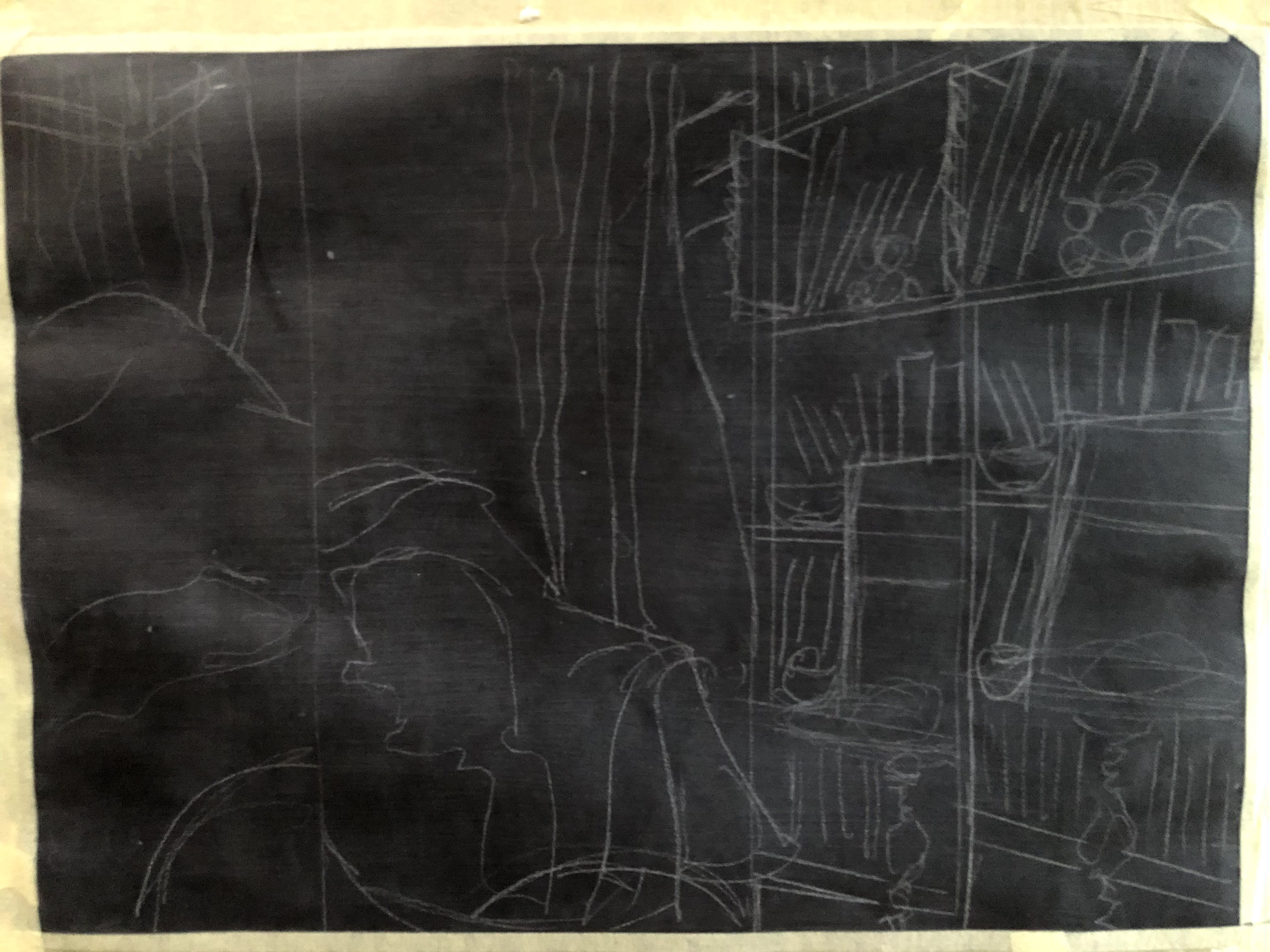
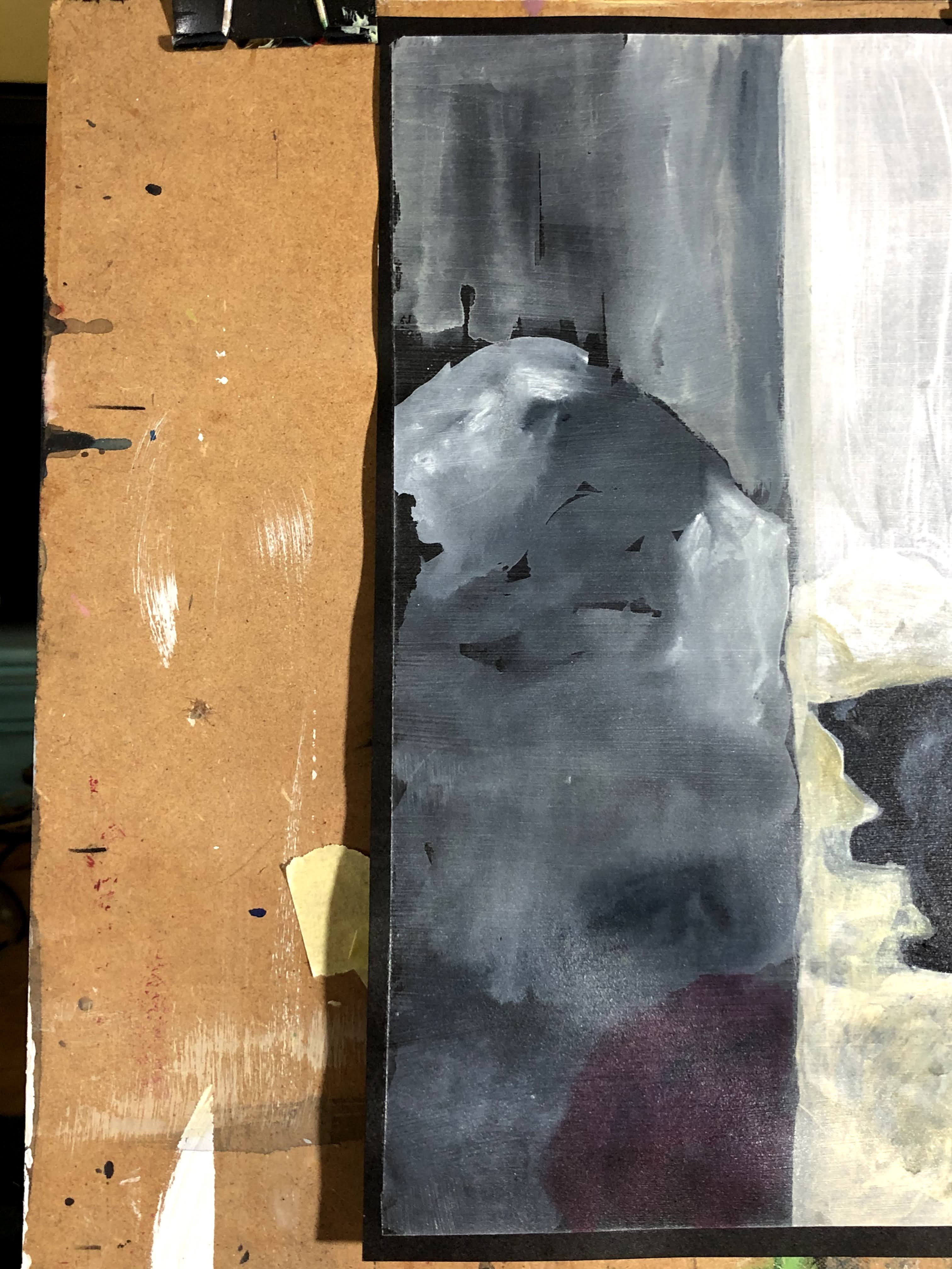
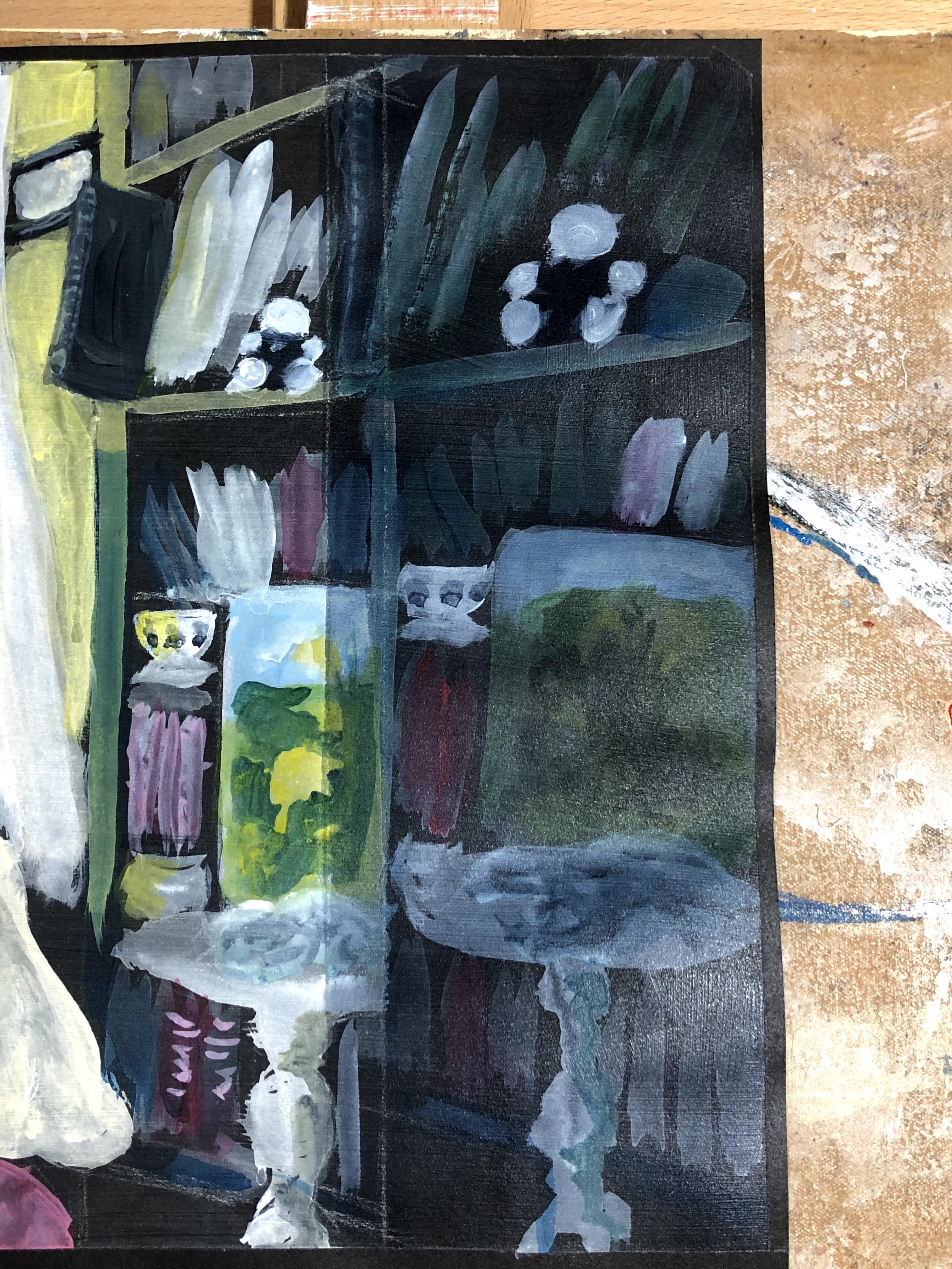
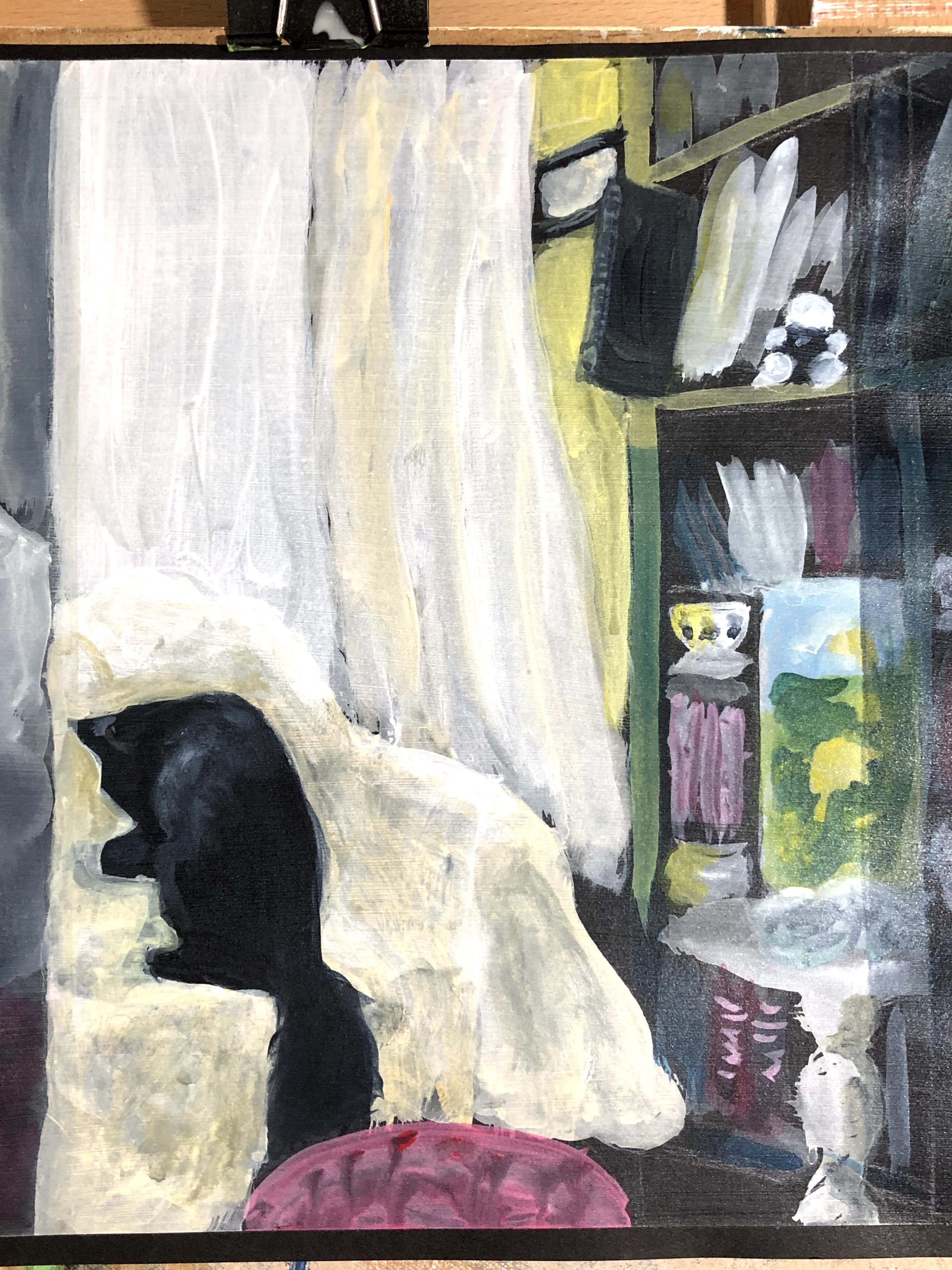
I’ve begun with a sheet of A3 black cartridge, primed with transparent acrylic gesso and with the lines drawn onto it with a silver pencil.
12th December.
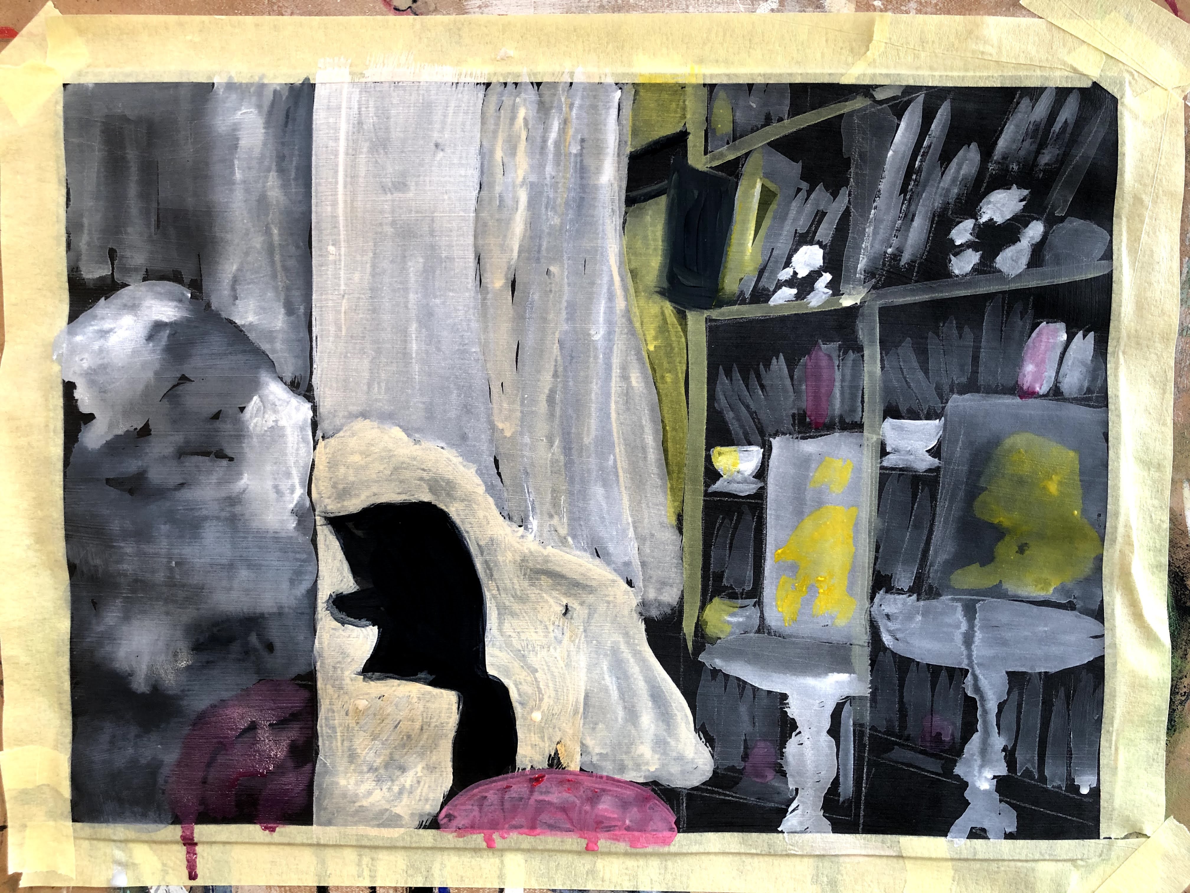
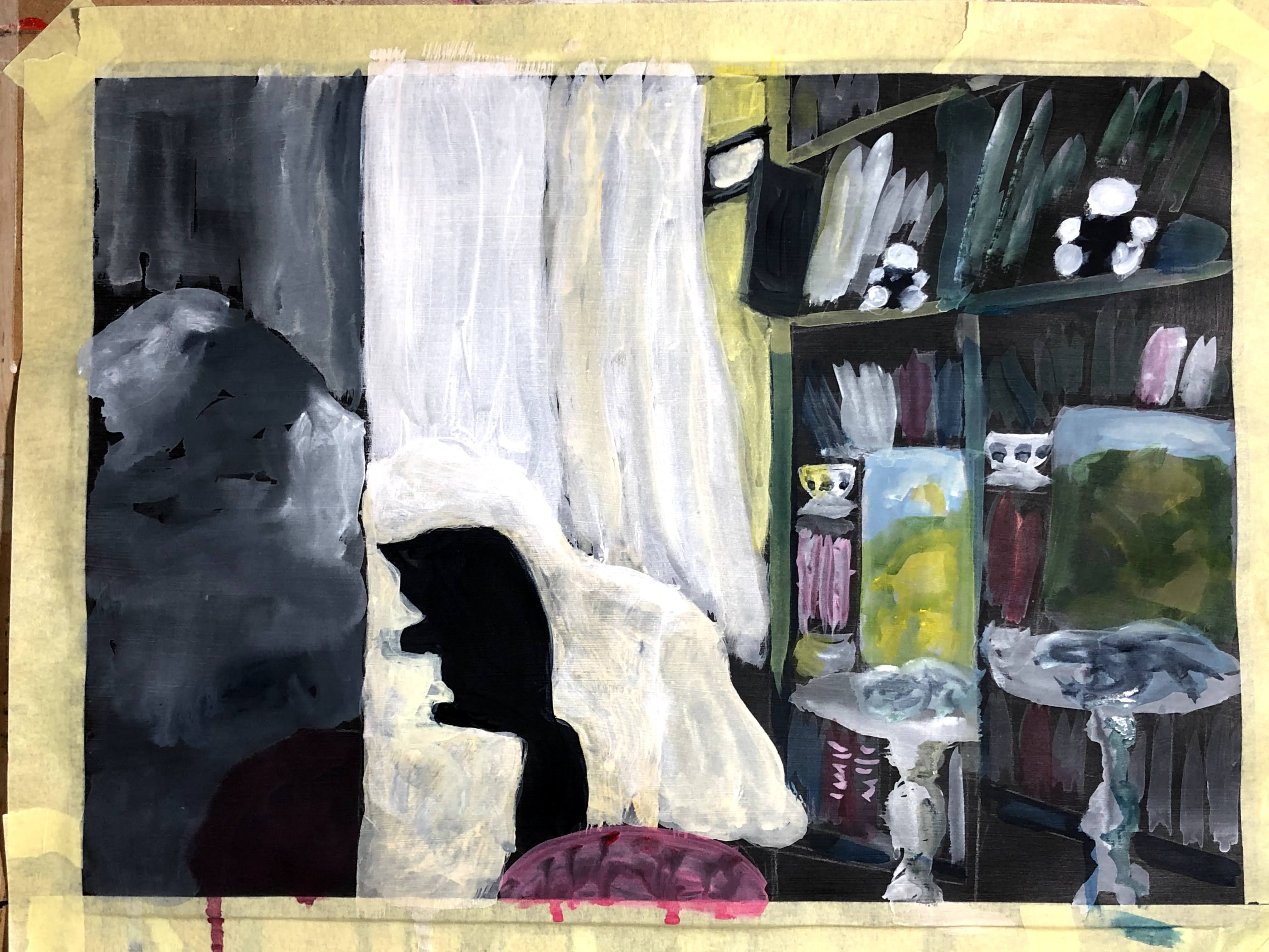
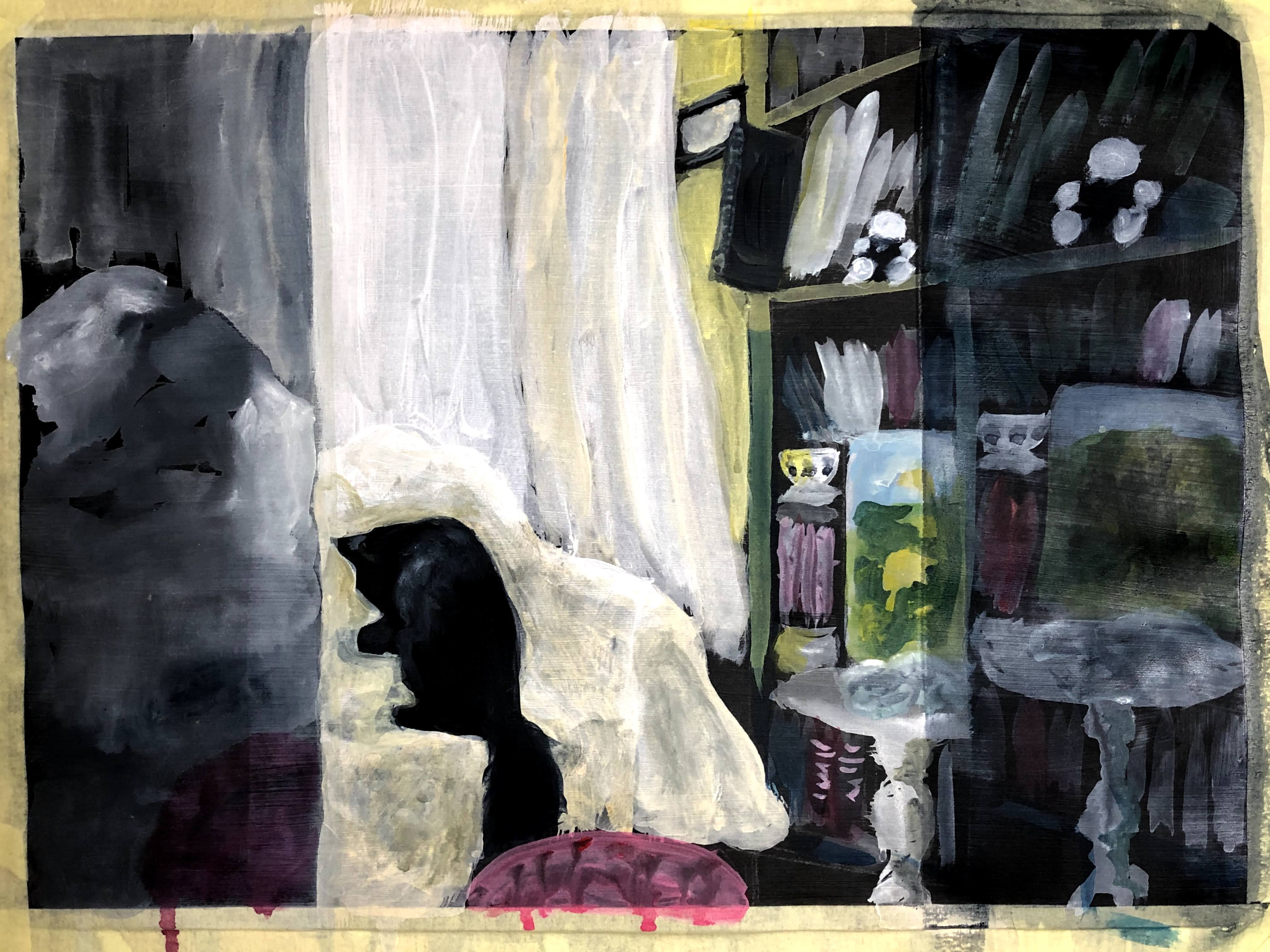
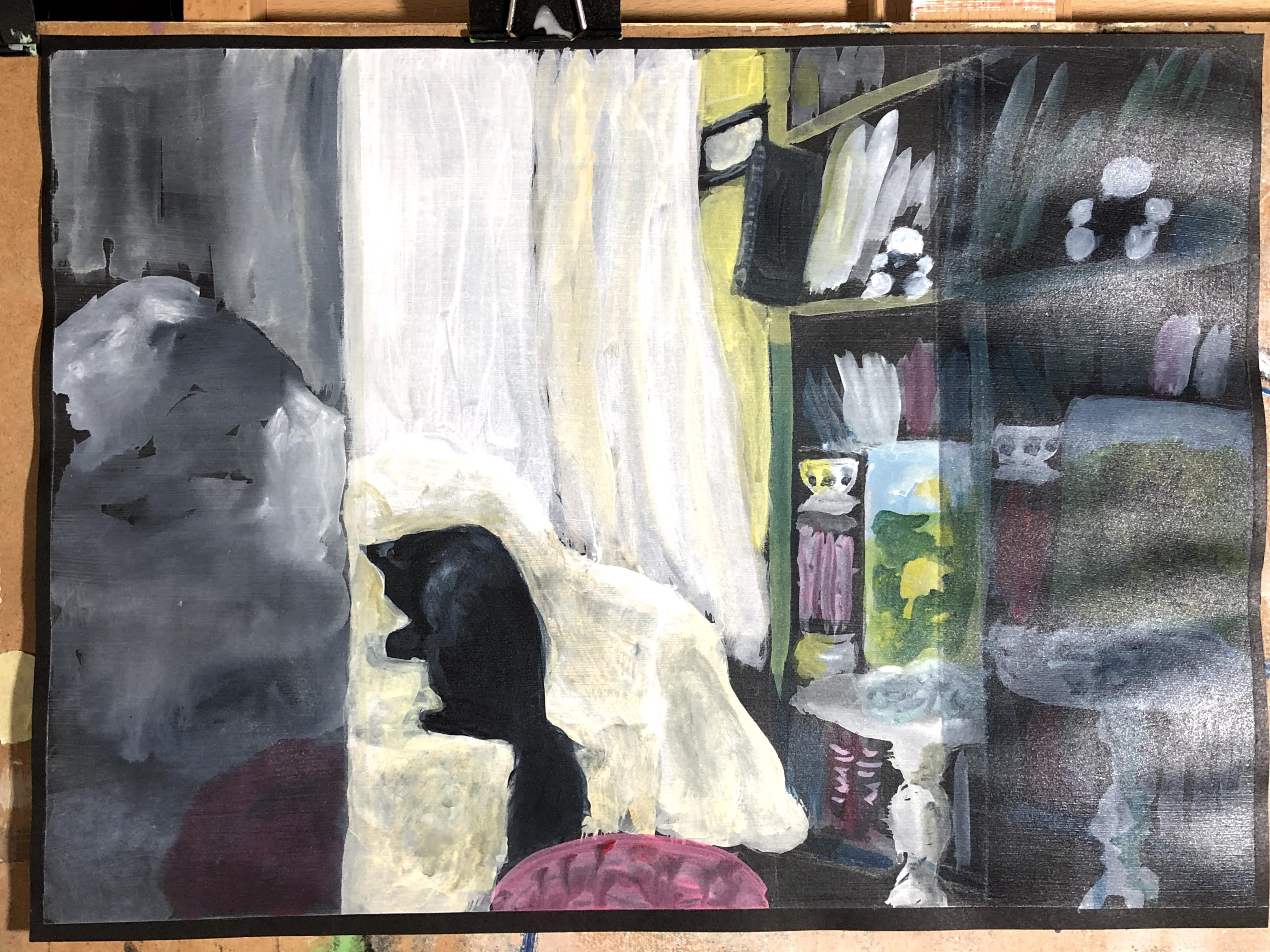
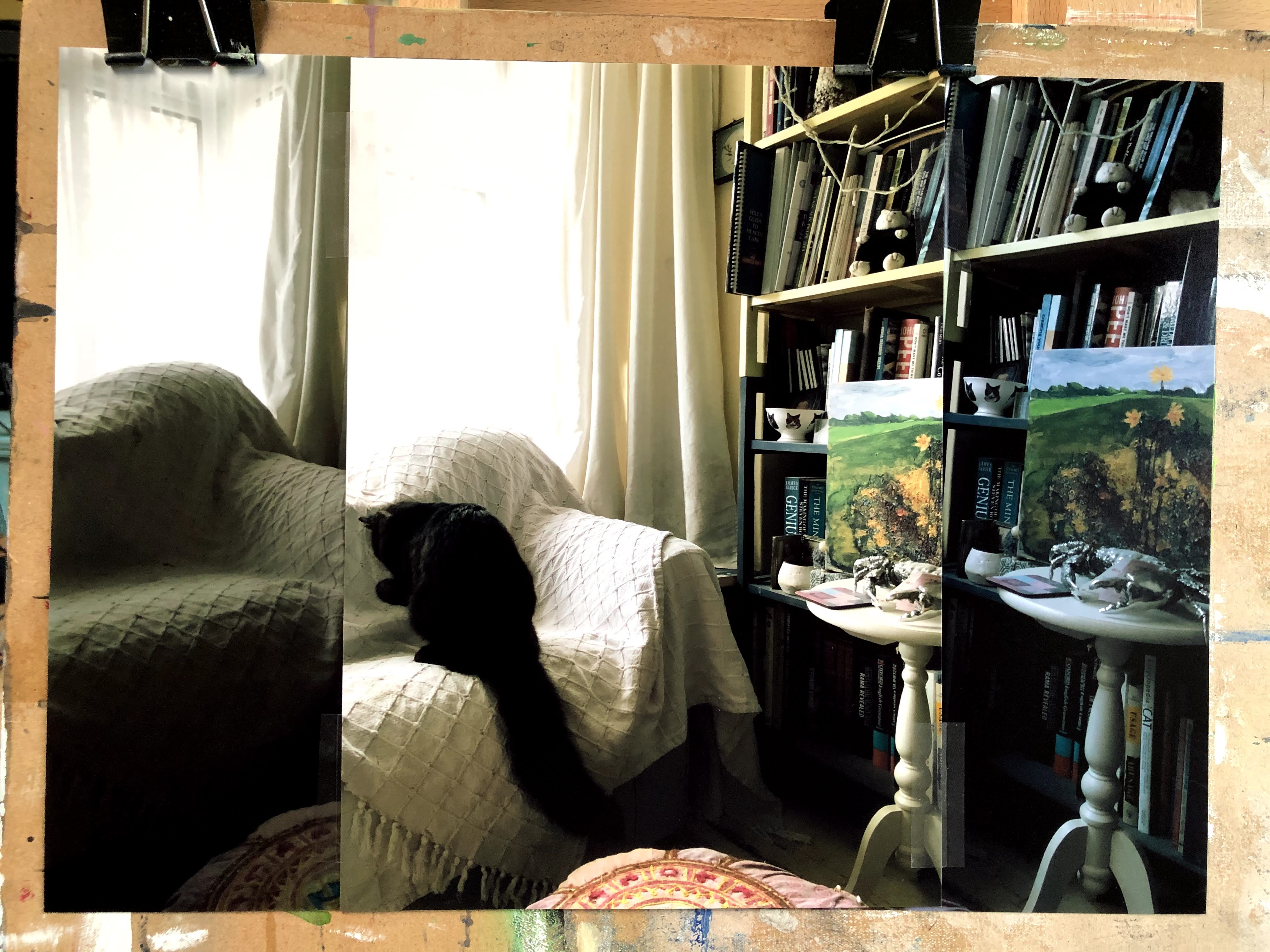
Reference photo taken of three separate images sellotaped together.
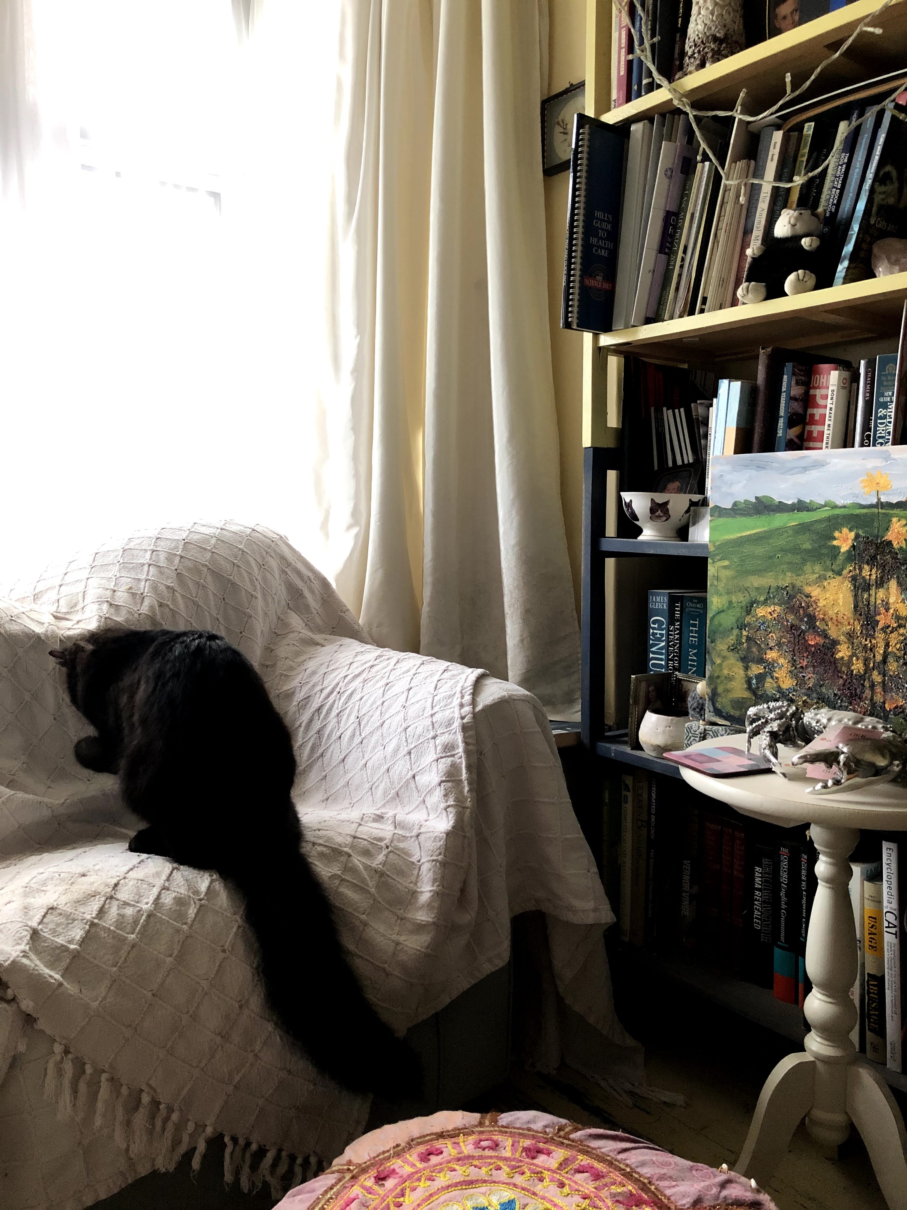
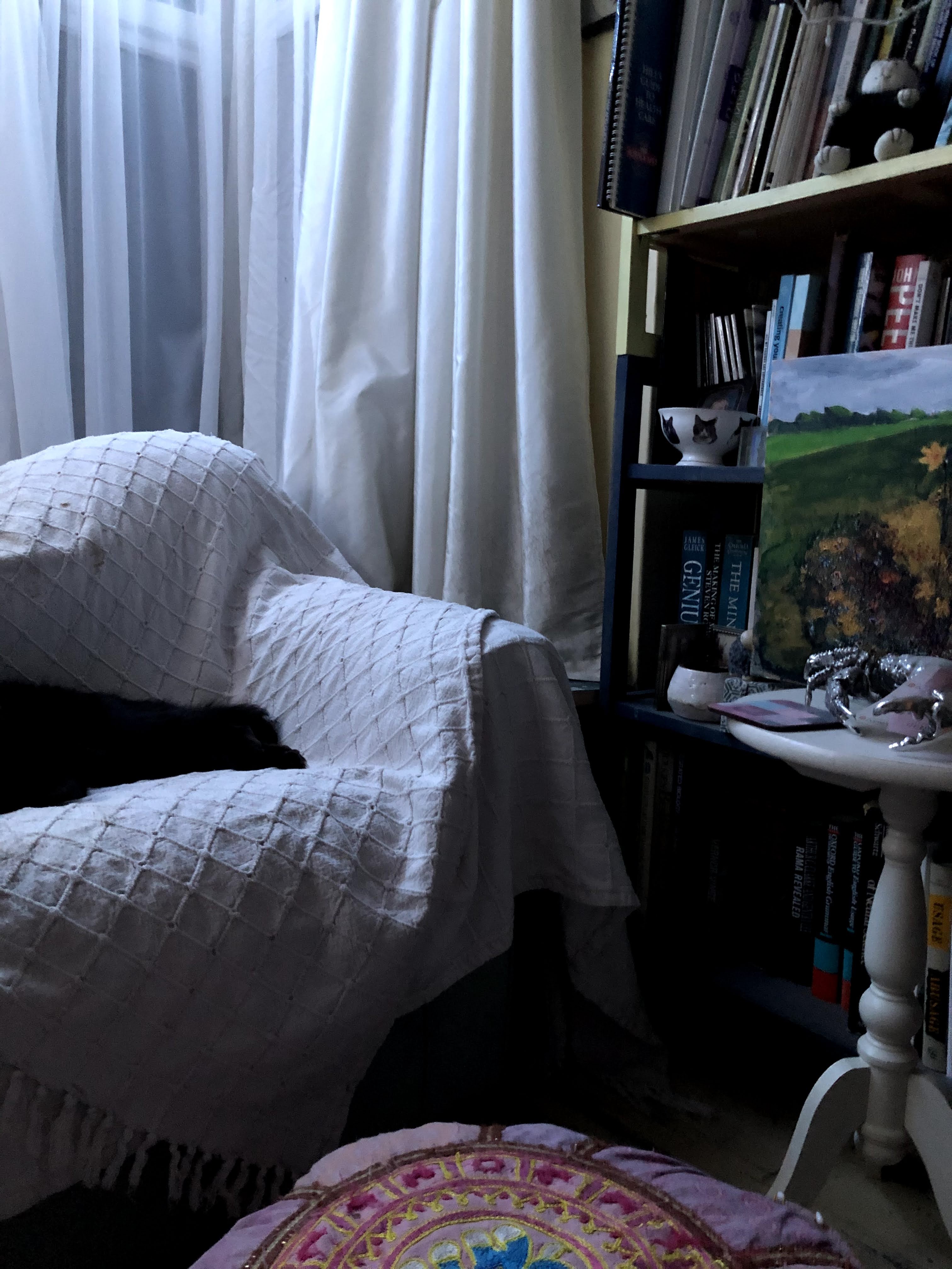
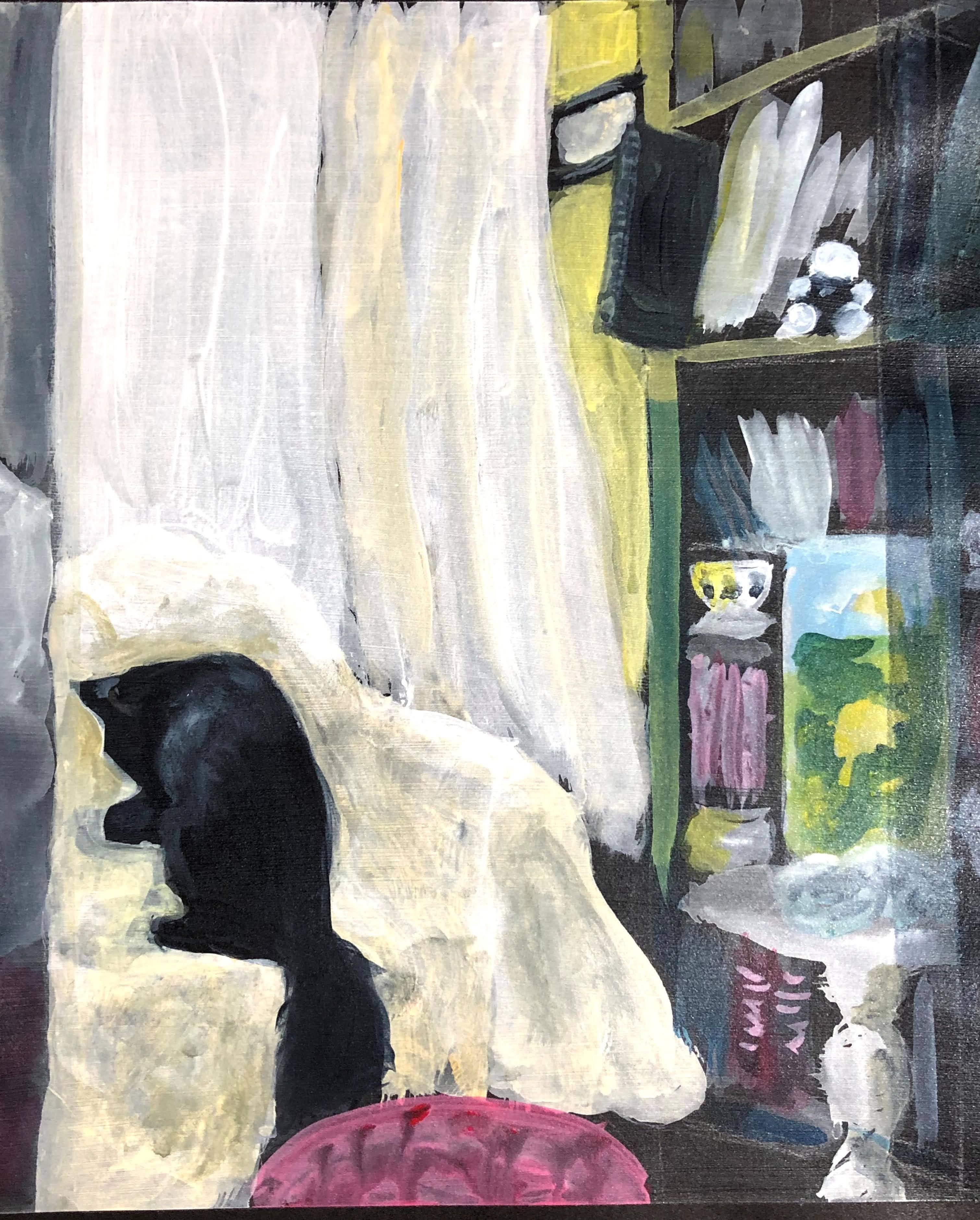
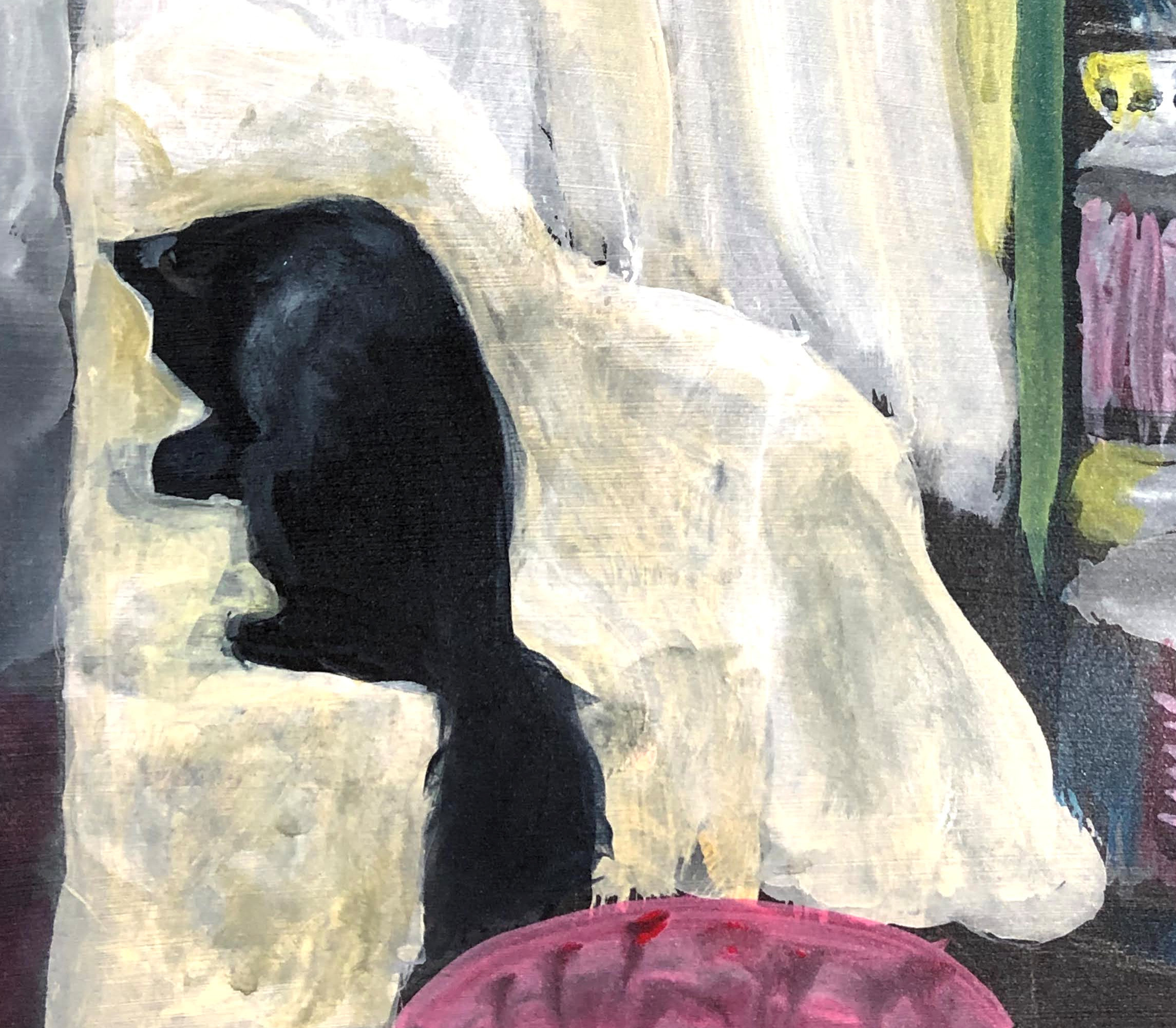
I have a favourite, and predictably, this is it. Mostly because it’s a cat, it’s my cat, and I like the way he’s turned out – especially that tail , but also because of the folds on the chair covers, the light at the window, and the drape of the curtains, none of which I was wholly conscious of doing.
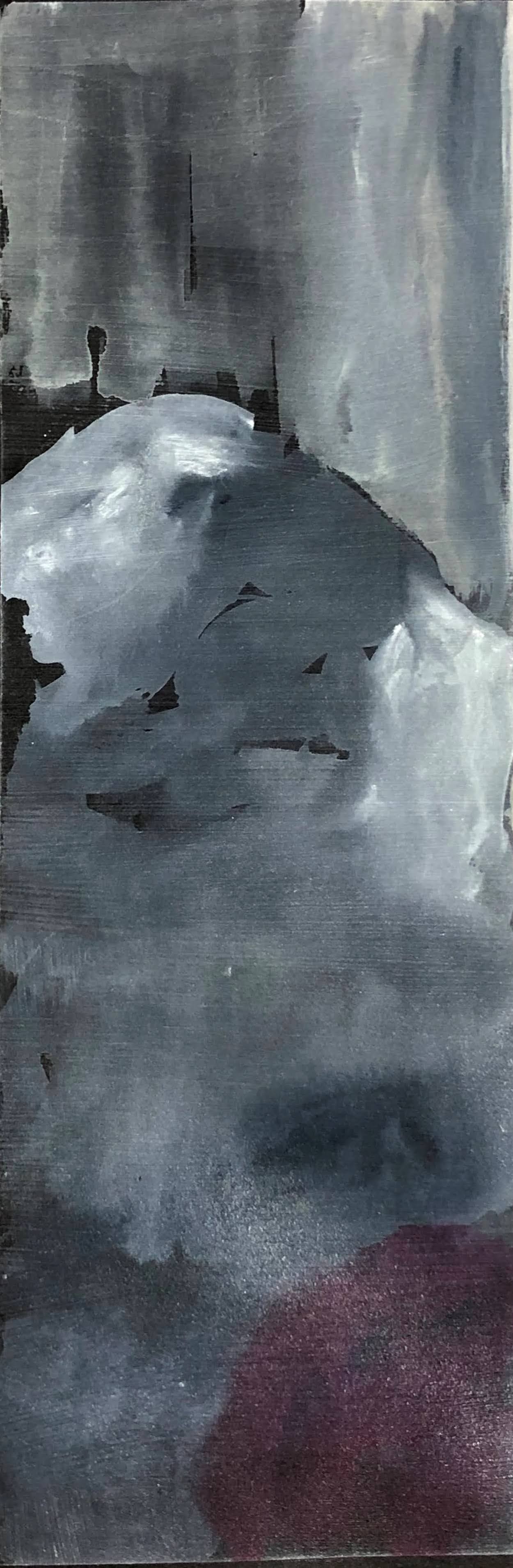
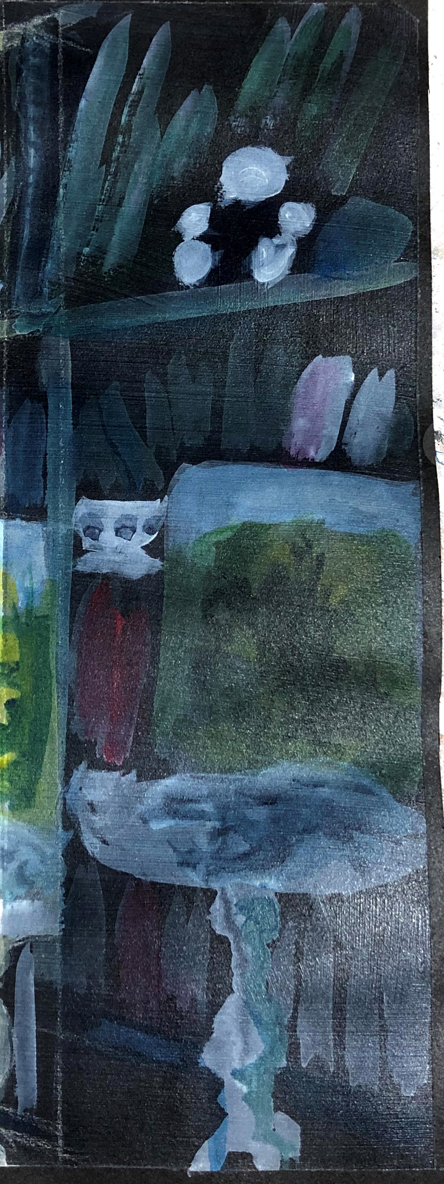
With this painting, it’s hard to see what or where the influences are. I know I was seeking to bring light into the central image, to give an impression of the room when light is very low through the curtains as it is on dark mornings, and to enhance in the third section the blue light coming from some christmas lights at the window. I think mainly my focus was on keeping some simplicity, and not over-fussing the detail which would have been a real temptation, given there is so much. I was also influenced by the effect transparent primer had on the dilute acrylic I was using to mark out the blocks and shapes – the way this dried and faded drove me towards a different approach, one of maintaining that lightness of medium instead of building towards my usual blocky flat brush trowelling of paint onto whatever surface will bear it. I’m also aware that the black cartridge filled in gaps that I would have been tempted to paint had it been white. I think it lent itself to this ‘triptych’ of paintings which, on the whole, were low-light images.
____
Diego Velasquez, Las Meninas 1656 Diego Velázquez – Wikipedia accessed 13 December 2020.
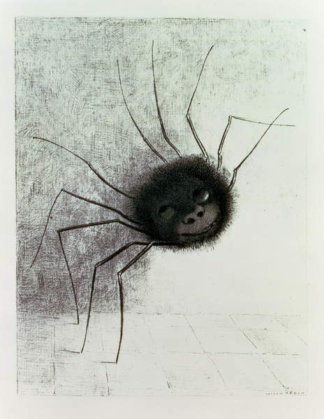
*It was Odilon Redon’s Spider (1881) and I have no idea why I associated this with either the name Bonnard or, in fact, interiors. It isn’t a spider either – no cephalothorax and way too many legs. If anything, it’s a Phalangium opilio (Harvestman). Cute face though.