Material differences.
This had me thinking of textures and also of one of the sketches I’d done earlier which features a series of door frames through from the kitchen to the front of the house. Based on this, I took an A3 sized cartridge sheet and sketched out the key vertical and horizontal lines associated with the doors, the lintels, the ceiling, a book case off in the distance, and reflections of a shelf in the kitchen via a long mirror. Only the sofa and chair are rounded and soft, the rest is wood, plaster, artex, and wallpaper.
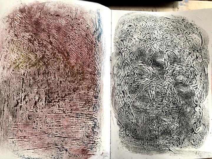
I’ve recently discovered acrylic gesso and so I prepped a couple of sheets in my sketchbook to see how scratching textures into a wet layer would facilitate the kinds of textures I might need for the task. I’d used a mixture of oil pastels, coloured charcoals and ink in an earlier exercise and liked the results when applied, blended, and scrubbed over a layer of gesso, so that’s what I thought I might do for this piece.
This is the exercise piece.
These the trial sketchbook ideas. This time I’d made deliberate patterns in the gesso although without a clear aim beyond providing a sub-structure of resistance for the medium. I’ve used oil pastels, and fineliner brush on each, plus ink and charcoal on the right hand image. I also washed each one with plain water to see how that interacted with the dry gesso and the fineliner ink. Interestingly, that technique seemed to allow the gesso to soften the ink in the right hand image but not in the other one.
First and second stage of the process.

The initial sketch was more than demanding – getting all those doorways lined up in the first place was tantamount to doing a Rubik’s cube, then discovering what a nesting nest of reflecting and other verticals and horizontals I’d created for myself made it the mental equivalent of two simultaneous cubes while riding a unicycle, and, Dear Reader, I have never once managed a Rubik’s cube nor even a conventional bike. I resorted to a photo and rulers but still found myself with angles and lintels and corners and edges that made the thing impossibly Escher. I think I have it straight now but it’s a good thing I’m not an architect.
Once established, I applied the gesso using strokes, dabs, and directionalities that might best reflect the component materials. The right hand image shows the first application of medium twenty four hours later when the gesso was dry and I think the floor boards illustrate best (at this stage) how I hoped this would work.
My feeling at the moment is to try to be very sparing with the sofa and chair in the centre. They’re so different from everything else – almost ghosts in their own space – that I’m reluctant to detail them. The next stage feels both exciting and terrifying but what’s to lose? Not a life, that’s for sure.
***
Another few hours, another layer. I can see possibilities for thickening this up and darkening the foreground. One discovery – white oil pastel doesn’t do actual white when it’s the last to be applied!

***
31st January.
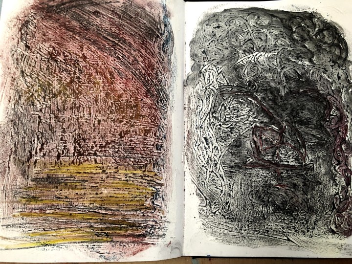
I wanted to see how Derwent Inktense would work with oil pastels and gesso and so I prepped a page in my sketchbook and left it to dry. Unfortunately (or maybe opportunistically because ‘every mistake is a gift’ [reportedly] according to Ryuichi Sakamoto), it curled and stuck itself to the adjacent page. When I’d eased them apart, a small landscape had peeled off onto the gesso page, leaving what could only be a fantasy seascape.
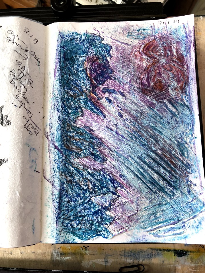
On the left is the softer non-gessoed paper torn from the previous page but stuck to the layer of textured gesso beneath. The rest is as intended – pre-textured gesso using a brush to make scrubbing, dabbing, and sweeping marks as a substrate to medium.
The first medium is oil crayon pulled across the surface to pick up ridges and leave the valleys untouched. This works on both surfaces but the soft paper, which is almost fluffy, is more absorbent and it’s possible to work the colour into the fibres. After blending on both sides, I drew in lines and channels of Inktense to see how that interacted with the rest. I’d like to consider this for the main task as a way of addressing some of the white space which, instead of being meaningful, seems just unfinished, so understanding a bit about how it would work in that context is important.
What happened was two-fold: first the Inktense blocks gave me some bright, sharp lines in the ‘valleys’; and second, when wet they ran and soaked into the gesso, leaving the oils untouched. An effect of softening the gesso gave me the idea of scratching into the medium to make more patterns (one of them revealing a sea monster top right!) and allowing further experimentation with scratching and biro marks. The area on the left reminds me now of crackle glaze.
So, I’ve discovered that Inktense can work well with oil crayon but that it needs to be judiciously applied or it will drown everything. Also that scratching as in sgraffito is a further textural option, and that whispery crackle lines might add detail without overwhelming an overall simplicity.
***
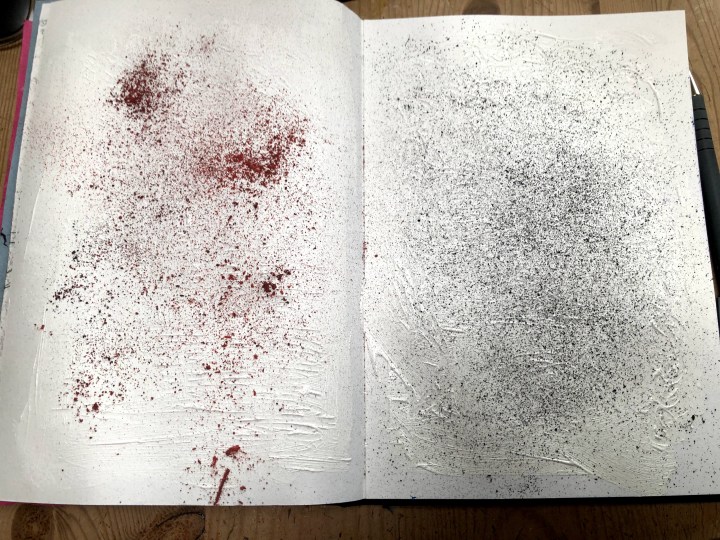
1st February, and a little more experimentation. These two pages are gesso-prepped, patterned, and sprinkled with charcoal dust. When they’re dry, I’m going to apply oil crayons, Inktense, and an entire flea-burden of scratching.
Blended charcoal over the patterned gesso, then given a pass with oil crayon. And is that a face in the second image?
Inktense pencils traced into the gesso furrows then brushed with a Derwent waterbrush. Interestingly, the charcoal became paintable and mixed with the colour. I’ll do some scratching at the surface once it’s properly dry but I think I have the beginnings of an idea about how to take my task to the next stage.
***
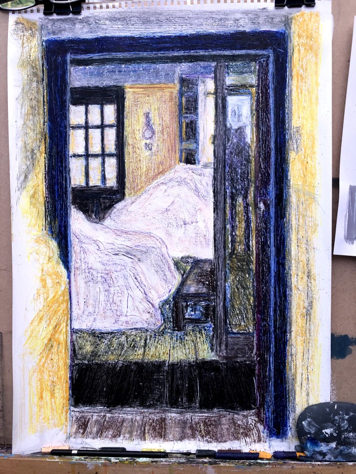
February 2nd. Progress. Today I’ve built on my experimentation of yesterday and begun layering oil crayon and charcoal, blending with a stump, fluffing with an old blusher brush, and scratching with calligraphy pens and whatever this thing is:

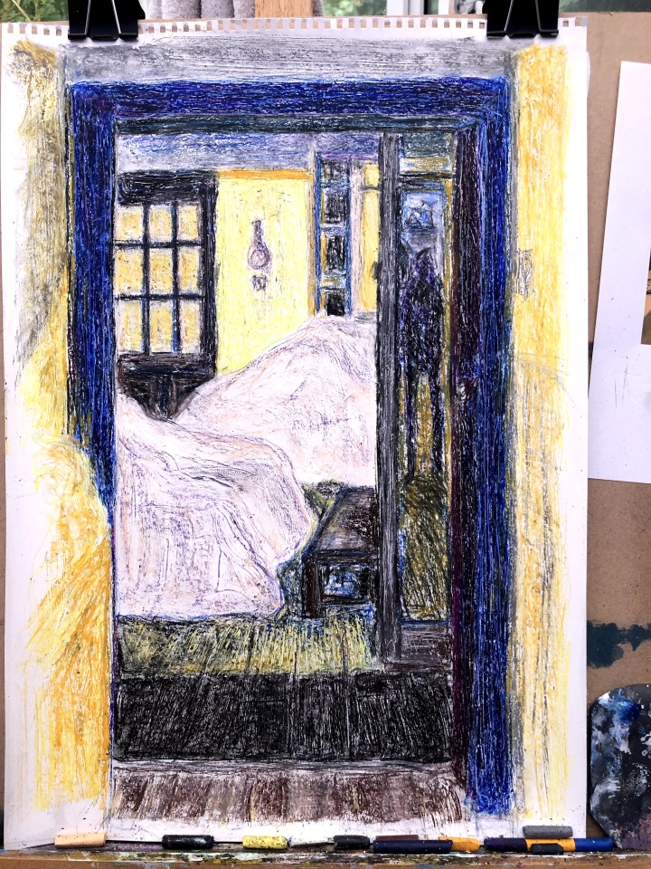
I’m looking now to creating a better sense of depth by focusing on tonal values. The foreground needs to be deeper and the windows much brighter. There’s a bright patch over to the right too where the mirror reflects the glass through to the back window. Bit of a challenge there, I think.
***
February 3rd and I think I may be about done with this. I risk ripping into the paper if I do any more scratching or scraping so I should maybe stop.
I’ve annotated this last part of the process in my sketchbook:
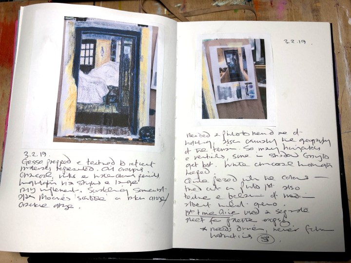
The horizontals and verticals were a nightmare and I wish I’d thought of highlighting them on the photo earlier in the process. Next time, that’s going to be part of the plan.
Also new is my use of the photo to develop a bit of a palette. Never one to follow the rules until I see a need, this crept up on me and suddenly I see the sense of it so here’s another idea I’ll be taking forward.

Much of the scratching was achieved with a stylus and a large DIY instrument, the purpose of which escapes me, but it’s good and sharp and has angles to it.
I’m actually quite pleased with the result so hey!
***
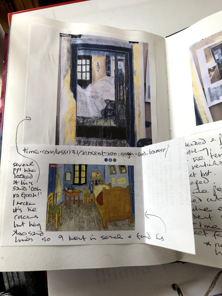
About five people now have seen this and said, ‘Ooh, van Gogh!’ I reckon it’s the colours but man, is that going in the sketch book!