")
Probably the first of several so I’ll collect them here. Hopefully, I’ll remember to come back!
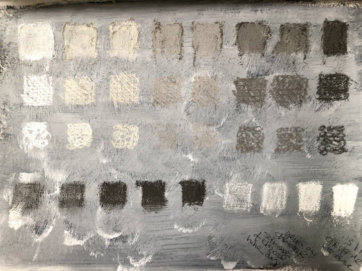
I’m still besotted with gesso so this is a pre-prepped A5 sheet in a sketchbook on which I’d blended dark grey charcoal before applying the gesso. The next day (today), I used each of a series of graded charcoals to make the boxes, finger-blending line 1, cross-hatching line 2, and describing small circles in line 3. Line 4 is the black and the white crayons applied with different pressures to give graded tones.
I’ve done this with pencil on a previous course but need to re-visit that exercise. A designer for The New Yorker front covers (or it could have been Tinker Hatfield who designed for Nike – I watched two of the series on design* through a slightly buggy fog last night so I can’t be sure, but who knew I’d be gripped by a documentary on trainers!) said going back to the basics of design through exercises (and now I think it’s the Nike man) was fundamental to practice. Both of them draw all the time, everywhere and anywhere.
*Abstract: the art of design. Netflix.
Top quote: ‘Inspiration is for amateurs; us professionals, we just go to work in the morning’. Attributed to Chuck Close by Christoph Nieman in Episode 1, Series 1 of Abstract: the Art of Design. This is very similar to the writers’ parallel about waiting for your muse and how you can, by all means, wait for your muse but you’d better be at your desk when she shows up. Stephen King’s advice, ‘Good writing is often about letting go of fear and affectation’, strikes me as wholly applicable here too.
***
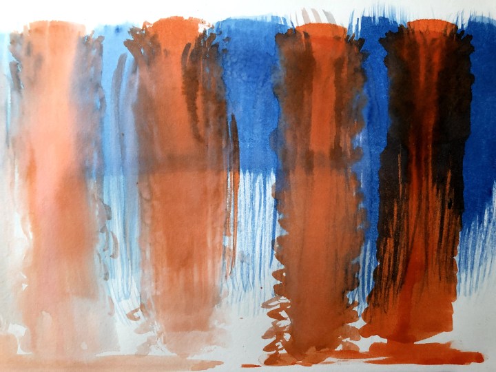
This is Winsor and Newton ink applied with a fan brush. I applied water first then fanned the brush down the page with an increasing ink load towards the right. Didn’t quite manage to stick with the one colour because the effects made me think of jellyfish and then those alien entities in Arrival. They were more grey/purple though. Missed a trick there.
***
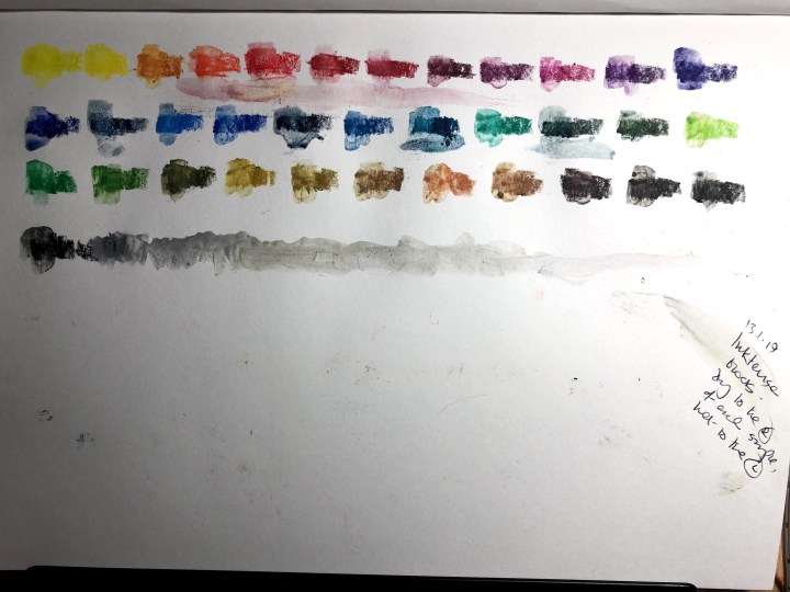
New Derwent Inktense blocks. I’ve sampled each one in order then used a Derwent waterbrush on the left of each so that the result shows the dry and the wetted qualities.
***
14th Jan. This is another batch of scales using just three colours at different levels of pressure. The medium is Derwent Inktense blocks and I’ve livened the patches up with a Derwent waterbrush.

The large green patch is made with vertical sweeps (as per illustration), semi-flooded with the brush, then dabbed with paper towel roll.
The objective with these small exercises is to try out all the media I’ve managed to collect in the short time since picking up a pencil two years ago. I have them, I use them, but I don’t know enough about them or what colour or shading or tones do. We could be here a while but I’m beginning to think this counts as down time, a more automatic but functional activity that leaves mind space for unconscious processing of the more complex thinking and working out of the bigger things. The artistic equivalent of folding tea towels, maybe.
***
