I suddenly recalled seeing a series of drawings of a bull by Picasso whereby he had gradually reduced its form from naturalistic to the barest of essential elements. Because I hadn’t seen that before, I’d had no real sense of the evolution of the end result, to me it just arrived in its primitive if elegant form somewhat out of the blue. Looking at the sequence now, I can begin to see what abstraction means and how it begins in what might be termed a more ‘real’ representation to end with an essence of that object.
My task now is to apply that thinking to an artefact of some sort.
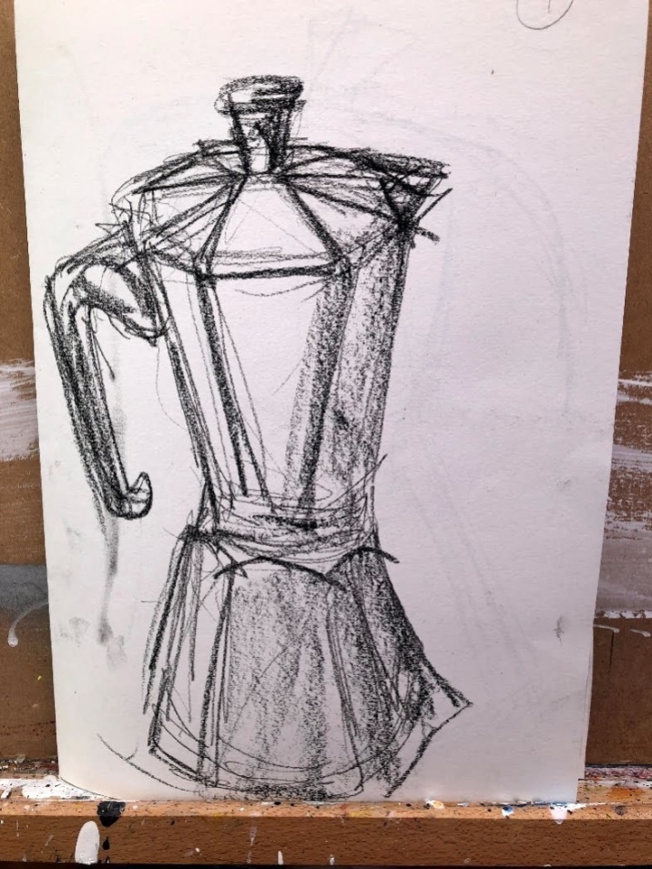
I found a coffee pot. It’s one of those that makes real coffee from ground coffee but that never makes quite enough. It’s a nice shape though.
Starting with charcoal pencil and using a kind of booklet format, I made a number of quick sketches to get the feel of the shape and, thinking of Picasso’s bull, a sense of what might be irrelevant to an ultimate abstract. Soon, it took on the sweep of a dancer with a long gestural stroke from the spout across the top and down into the handle. I moved onto black acrylic wash but with less subtlety at first than was ideal so I lightened my hand. Finally I deliberately pressed another page of the booklet onto the ninth wet sketch to make what a printing colleague told me from the previous exercise is a mono-print. The result is, to me, very appealing as an abstract and because the image is reversed, totally alien to my hand. This short video shows the progression:
Video made in Filmora9 video editing software.
I know now where I’ll begin tomorrow.
21st June. Using a larger support, A1 cut into two pieces, I prepared one half with transparent gesso then, when dry, added media in layers, printing across to the second surface between each one. I used Lamp black, System 3 copper, System 3 rich gold, and titanium white. Oddly, I prefer the source surface in the video and the print surface in the real world. I’ll have to think about why that is but my suspicion is that it’s the way digital cameras handle and adjust for light conditions.
Video made in Filmora9 video editing software.
Individual images.
This first group shows the progression from a form of realism through to a very stylised image which just contains some simplified shapes. The print [bottom right of the monochrome group] is very skinned down and it was this that set me off on the second series.
The series with colour was a very deliberate use of two individual surfaces; one the primary source, the other the recipient. The procedure was a very straightforward overlaying of the primary over the recipient between each layer of paint with a view to transferring some but not all medium across. This, I believed, would skin down the original image and give rise to a new set of shapes. It was hard not to see it mutating into a dancer, and I also found myself somewhat influenced by some Aboriginal paintings I had seen in an Arts Society video lecture. The colours and shapes probably come from there and also the glow of rich coffee. I can almost smell it.
___
Picasso, P. Bull. c 1945. [online] Available at https://www.artyfactory.com/art_appreciation/animals_in_art/pablo_picasso.htm. Accessed 21 June 2020.
Aboriginal art – recording the dreamtime. Rebecca Hossack. The Arts Society July 2020. [online] Available at https://www.youtube.com/watch?v=TI18rQLdQTQ. Accessed 21 June 2020. I find it hard to recommend this lecture. In the context of #BlackLivesMatter I wonder that neither the presenter nor the Arts Society recognised the overwhelmingly privileged position Hossack was operating from in her behaviour with Clifford Possum. Describing how she brought him to London by telling him that yes, he would meet the Queen, she not only forgot she had promised this but then was able to ring a contact at the palace to try to arrange it – imagine that – then later met another contact at a gallery who actually did arrange it. This was not just white privilege but wealthy white privilege and barely any sense that Hossack even saw this. The art is wonderful though. It was worth watching for that but there are undoubtedly better sources.
I believe this exercise evidences all four learning outcomes; LO1 through translation of sketches into monoprints by folding the paper and progressing through those stages; LO2 by using both paint media and film to generate and then evaluate the images; LO3 through recognition of Picasso’s influence and that of Aboriginal Art via the Arts Society video; and my practice of contemporaneous reflection.


Can’t help feeling that you’re onto something with your reflected prints but not sure what it is exactly. Something good I dare say!
LikeLiked by 1 person
I don’t think I can help either of us with that! It’s certainly interesting, and now you call them reflective it’s making me see the source as part of the picture rather than something to dispose of like, well, coffee grounds. Hm …
LikeLike
Remind me of “ghost prints”, when you take 2nd impression from a used plate. I always think of them as “memories”.
LikeLike