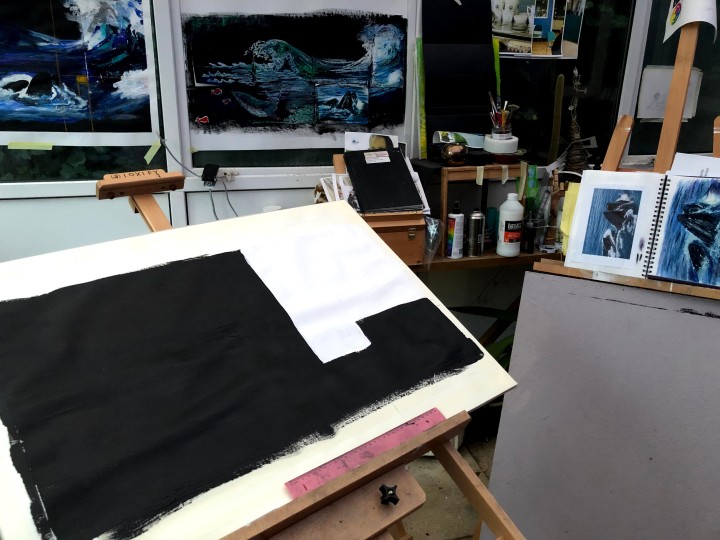
After doing a Fibonacci on the previous iteration, I put both of those plus the original sketches in view and set up for the next version. This involved taping and stretching a piece of A1 cartridge on the board, marking out my golden ratio rectangles, and prepping the different areas with black or white gesso.
Following a rule may seem a little anal but I’ve always found that the best way to evolve in whatever area is to learn the rules so you can break them by design. This is an exercise in rule adherence with a view to throwing it to the winds in a way that says more and intrigues more than staying in lane. I suspect you have to be quite good to get away with that!
About a week later and I have something I’m almost happy with, and on the advice in the instructions that I can use any medium or media and the principle that drawing with paint is a legitimate interpretation, this is acrylics applied with brushes in the first instance and then palette knife.

I began with a number of ideas such as incorporation of text and copying the styles of four prominent artists. I also had in mind a need to demonstrate something of what I’ve learned over this module and so I wanted to show composition, perspective, movement, and detail. My theme was the sea because these are colours I like, and the sea is a powerful element in its own right that is being affected, along with all the life in it, by our actions.
Having had the idea of four artists and, at one point, considering submitting copies of four actual pieces by these artists as one piece of work (the preliminary sketches are here), the purpose of the series or the triptych became important. Quite often these were/are intended to convey a message, especially maybe the religious ones, and so I needed to think about how to incorporate that into what otherwise would just be four copies in a vacuum of meaning. I didn’t want to be heavy handed though – at this stage it would seem to be at least as much about my developing technical skill than any significant communication. Still.
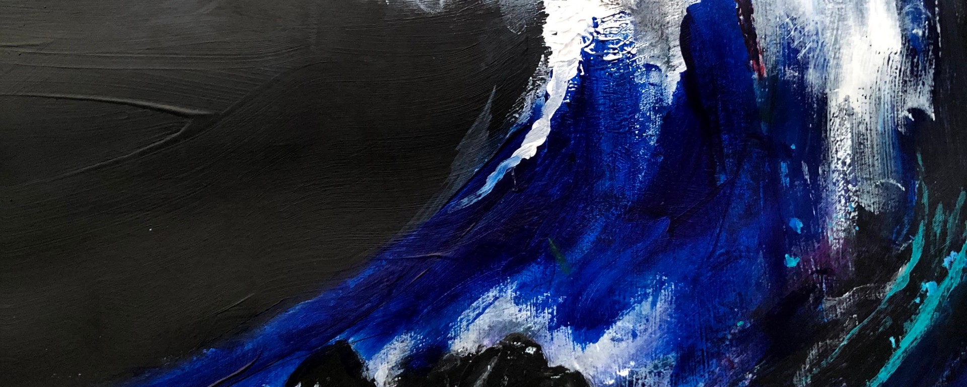
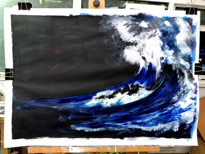
My first ideas simply slapped the four items onto the support in a kind of date order, which also ran from stylised to expressive. The resulting composition was in effect, no composition at all and so I needed to re-think. I began with the huge wave on the right – a ‘copy’ of the photograph representing the biggest wave ever recorded in the north Atlantic executed in the energetic style of Maggi Hambling. I painted this in loaded brush strokes first then later applied scrapes of colour over other colours using a small palette knife. I like using a base of colours then layering up and watching what pops through but it also allows me to add weight to an image and here I wanted a wall of water rising almost vertically from the sea and crashing over itself from its peak. There’s a detail below.

I painted in the feeding whales next but standing back, I could see they were too low so that the balance was wrong. Separate and not part of the composition. At this point I realised I had missed the focal point of the Fibonacci spiral so I gessoed the whales out and re-drew the spiral to see where the focus landed. Then I moved my whales up. The focal point now is at the jaw of the whale where the water is at its most turbulent, washing down and around the massive bucket of a collecting device whales use to sweep up krill. This element of the composition also makes a transition from Hambling’s expressionism to Turner’s more blended approach although I’ve really only hinted at this by using my finger on wet paint and washes to soften edges. What I wanted as much as anything was to give a sense of the size of these creatures and I hoped to achieve that by showing the turbulence in the waters around them – confused, neither one way nor another, waves coming in and going out at the same time. I think also, looking at it now, that moving them up closer to the towering wave may also suggest great size.
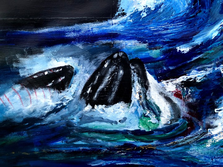
The next transition is one from Turner to the more stylised approach of Hokusai. This developed in my sketches from waves to representing another whale as a 3D computer generated frame for animations after discovering that the image I’d chosen to copy was in fact an animated artefact and not a real whale at all. The lines across the whale’s body are reflections of that idea and also, I might argue, our increasing loss of connection with the real world.

Finally, on the far left and creating a diagonal with the top of the wave, are tiny touches of orange, fantasy krill that are all that’s left of Klee’s golden fish. While they’re clustered over to the left in an isolated group, there’s a less prominent trail of them under the whales and up into the wash around the large whale’s jaw. The idea here was to provide connection and continuity across the various elements as small things do in the real world and ideas do in the cultural world. I had to murder some darlings for the sake of composition and I think the result is a more subtle progression from the remote to the immediate, the unreal to the real.
A word about colour. While the gold/orange is a nod to Klee, it also allows me to add small accents elsewhere to enhance focus and energy. The red I used to represent the abhorrence I feel for the whaling industry. These whales are harmless – unless you are krill, obviously! – it’s their blood that is shed and so I used red for the wire frame and dropped a small patch into the water near the jaw. These seemed to me to be sufficiently evocative for subliminal messaging, no need to hammer anything home.
The shine at the top is an artefact of the light hitting the dried acrylic surface. There is a very light pencil line dividing sky from sea, neither of which I’ve detailed in any way although they aren’t both black as they seem in the photograph, and the sea is in fact layered with gloss medium on a black gesso base which also doesn’t show very well here. I’d used the gloss to differentiate sea from sky – it is reflective after all – and very deep black/blue applied with a foam roller over black gesso for the sky. I was very tempted to add some detail to that space but if there’s one thing I’ve learned during this module it’s to leave well alone! Negative space, like dark energy, is powerful stuff and I’m just learning how to use it.
My next step is to contact my tutor to check that acrylics are permissible and if not, to render another iteration using acceptable tools. It would be different, they always are. It might be better, that happens too.
I woke up this morning knowing I was going to crop this. Height and kinetic energy seem more important than empty space.
Paintshop Pro crop #1 includes both whales and maybe doesn’t have the height.
Crop #2 includes just one whale but actually still doesn’t emphasise height and that’s probably because the wave has its highest point over to the left and falls off to the right so unless I reduce this to a strip encompassing that peak, I won’t get the impact I’m looking for. So am I looking for the right thing?

Vertical using soft pastels.

I like the height but the medium isn’t giving me the luminance I want. I think the next experiment will be using gesso-prepped cartridge in the same orientation but with areas selectively black or white.
This version is inks, oil pastels, and soft pastels on patches of black or white gesso for texture. It’s becoming more abstract with each iteration, it seems to me, but also perhaps freezing the moment in time, in history, to preserve what might soon be lost. I quite like the granularity of this, and the way the shapes both slice and are sliced by the various layers of medium.

After some reflection I found I was less happy about this distancing from the original idea and so I went back to (almost) basics, applying black and white gesso blocks to areas more or less corresponding to the outside and the inside of the Fibonacci spiral then drawing out the wave areas with pencil and further blocking in areas of colour using Inktense blocks.
Once dry though, this seemed thin and unprepossessing, incapable of carrying the enormous elements – the whales and that towering wave. I went back again to acrylics and beginning with the wave structure, built on the Inktense with energetic gestural marks after Hambling’s style.
When I had this in place, I printed out the crops that isolated the whales from the rest of the image in the previous iterations and assembled these, smaller and in greater numbers, within the curve of the wave. This is not where whales would be feeding but for I think artistic licence in the interests of magnifying the power and force of the elements and placing them almost at the focal point of the golden ratio is an acceptable misuse. This is the positioning.
 Once in place, I outlined the shape of the whole with a black fineliner then drew in the whales using a fineliner brush to guide me in the painting of them. At end of day, I am very nearly happy with the outcome, achieved by layering paints onto the Inktense, using both brushes and fingers to draw, blend, and tease new shapes of turbulent water, washing with a wet cloth to reveal the underpainting, and pulling off fragments of colour with masking tape. I want to detail a little more tomorrow but for now, this is where I am.

There is no light in my conservatory/studio so I use a daylight lamp to extend the time I can work there. This inevitably changes the colours but I want to note here my attempts to bring in some Hambling-esque vigour of the rising wave, blending around the whales (which draws on Turner) and some tiny embellishments on the wave that I brought from Hokusai. I’m always more taken by the digital image than the actual one, maybe because I see things in it that I’m too close (in terms of execution) to see in the one on my easel. For instance, the turbulence around the whales seems far better to me on screen, as does the energy of the wave itself up around the top and towards the centre. And the misting, achieved by finger-blending nearly dry acrylic into the black gesso. It reminds me of how a volcano erupts and I suppose there must be similarities of upward and outward explosion due to fluid dynamics. I’d quite like to replicate that sheen from the lamp reflecting on the gesso but I may not have the skill for that and have to settle for leaving well alone.
Today there’s better light but also more reflection which takes away the drama of the expanse of black. I’ve added two tiny strokes of orange, each nodding to Klee’s Golden Fish but one of them also positioned, to my eye, right on the central point of the Fibonacci spiral. The faint red areas in the sky to the left are intended as an indication that this is not empty, there is light of some kind. For me, they hint at the aurora borealis but don’t describe it.
Here are some details:


I’m going to leave this one alone now and, since I have time in hand, think about something much smaller and maybe going back to the original idea involving text.
As an aside, I usually listen to music when I’m working and my choice for this assignment has been Woolf Works, a ballet by Wayne McGregor, scored by Max Richter. The ballet describes the life, torments, and eventual death by suicide of Virginia Woolf. The final scene shows her alone and then disappearing into the back drop of moving waves in the slowest of slow motions. It’s a poignant and beautiful thing.
This is another beautiful thing – Christmas day on Lancing beach with a sea and sky straight out of a pastels box. I doubt I’ll ever tire of seas like these; the wild, the overwhelming, and the quietly, deceptively, acquiescent. I would miss green if we lost it, but seas draw me more; they’re our inner space and still alien.
This is my ‘small’ experiment. My idea was to make four images in the borrowed and re-purposed styles of Hambling (wild and gestural), Hokusai (stylised, drawing on woodcut), Turner (atmospheric and blended), and Klee (verging on naive). I used an A3 sheet of hot pressed watercolour paper which is quite firm and robust compared to cartridge; divided it into areas I thought worked best for each image based on some earlier sketches, prepared each small area according to the media I’d chosen.

The first drawing uses soft pastels in Hambling’s energetic style and the wave form is also the capital D in Durer from the poem ‘The Steeple-jack’ by Marianne Moore which goes back to my earlier idea about using text as part of the whole. Top right is the much more stark and stylised drawing of the eight stranded whales which the poem suggest Durer would have liked to see. After several sketched iterations involving coloured inks and complex patterns, this version emerged simply from leaving the black gesso of the whales drying before painting in the white gesso of the background. Part of the stanza describing Durer’s supposed attraction is written in by hand (my handwriting is dreadful and at one time I would have used Letraset for this kind of thing but had none to hand) and painted onto the whales themselves.
Below is the Turneresque section which seemed appropriate for the words describing sweet air (and I realise just how ridiculous these propositions sound as I write them!). I’ve used soft pastel and smudged this into the off-set capital A so that it might appear to be an extremely tall edifice on a flat landscape.
At the bottom is Klee’s Golden Fish, his style suiting – to my ear and eye – the part of the poem describing waves ‘formal as scales on a [fish]’. This was very hard to replicate given the scale. I’d used soft pastel and coloured conte on black gesso for my copy of this painting but those are such hefty pieces of medium for something so small.
The paper is white but that seemed a poor background for these four individual pictures. To try out ideas, I imported a photo of the whole into Rebelle software and coloured the blank paper. Black worked best to pop out the images but at the same time absorbed the bottom one and so I tried using a charcoal brush (digital) to give each a rough chalkboard outline in white. This too worked for me, not only by differentiating the fish drawing from its background but also by compensating for my difficulties with precision in line drawing.
Finally, and again in the absence of lettering transfers, I printed, cropped, and glued parts of the poem onto the black background areas where white pencil failed to standout and white ink was a disaster of cack-handedness.
I’ve learned quite a lot about the strengths and limitations of various media, the resources I would need to really make this sing, and my own lack of skill in execution of detail at this scale. I like the result but really I would think almost any A level art student could make a much better job of it. Conclusion: stay with the large waves and the living whales!

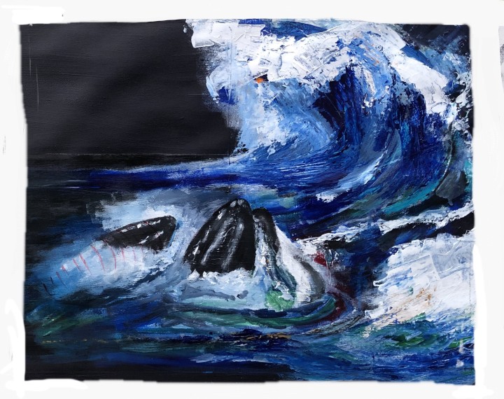
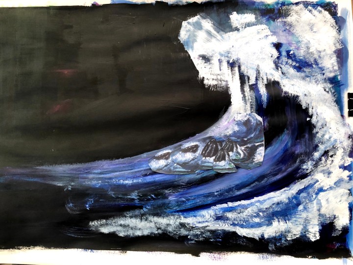
The final iteration, taken from a slight distance to reduce the tendency for my phone’s digital processing to lighten the dark areas. Below, a detail showing the configuration of the whales beneath the wave and some of the detail and the blending in the foam.

I’ve enjoyed doing this, and the process of exploration from copying the work of known artists, putting my own interpretation on those, experimenting with text, avoiding too much of a ‘message’ while knowing there’s one in there. If it makes anyone feel cold when they look at it, I’ll be chuffed because it makes me shiver.

Love seeing this evolve. You’re explaining your process very well here as far as I’m concerned. And your drawing painting is coming on apace. Very good!
LikeLiked by 1 person
Thanks – I’m working on the theory that while perfection would be nice, ambition and not quite meeting that for reasons I can articulate might actually be a more productive process. I’ve had a wild time with this – the kittens have begun climbing everywhere and up the easel is one of their passions. There were paw prints in the gesso on this at one stage!
LikeLike